 Download PDF
Part 3 - Basic Widgets
9. Buttons and User Actions
9.1 Adding Buttons to the MainWindow
An essential control element of the MainWindow object is the button. This is a familiar component in many windows - think of the buttons you see in dialog boxes, typically labeled "OK" or "Cancel." While buttons can also display images, we'll focus on the more common use case for now: a button with simple text.
In Chapter 6, we created the MainWindow, which functions as a widget itself. The MainWindow organizes and contains various elements, such as Buttons, Labels, Input Fields, List Boxes, and more. Essentially, the MainWindow acts as the parent widget, managing all other components within the application, with those internal widgets serving as its children (refer to Figures 2 and 3 of section 7.1).
Keep in mind that since the MainWindow is a widget, adding another widget like a Button means they share similar properties. Therefore, the table in the previous chapter is applicable. Let’s explore how this works.
9.2 Creating Reusable Exit Buttons
We'll create a window with dimensions of 400 x 200, a title, a white background, centered on the screen, and an icon. You should already know how to do this. The widget we want to insert is a Button, sized 100 x 50, with text, a grey background, centered, and an action that triggers when clicked.
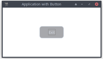
Figure 9.1: The Main Window with a Button Widget
Here’s the code:
# invoke the modules Application, Buttons use Prima qw(Application Buttons);# the following should be clear to you my $mw = Prima::MainWindow->new( size => [400, 200], text => 'Application with Button', backColor => 0xFFFFFF, growMode => gm::Center, icon => Prima::Icon->load('icon.png'), ); $mw->insert( Button =># both the Button and MainWindow widgets share common properties size => [100, 50], text => 'Exit', backColor => 0xcccccc, growMode => gm::Center,# the `onClick` event is linked to a subroutine that handles closing # the window onClick => sub { $::application->close } ); Prima->run;
Listing 9.1: The Main Window with a Button Widget
Let’s explore how the
- The most common event for buttons is
onClick - The
onClick event here is called when the user presses (or otherwise activates) the button. $::application is a special global variable in Prima that refers to the main application object. It represents the top-level application instance that manages all windows and widgets.->close : this method is called on the application object to terminate the application. When you invoke$::application->close , it triggers the closing process for the entire Prima application, which effectively closes all open windows and ends the application’s event loop.
Of course, the subroutine can be extended, which we explore in the next section.
9.3 Default Buttons and Tooltips
Now let’s add two nice button features: default and hint
9.3.1 Setting the Default Button Property
| Property | default |
| Description | Determines whether the button responds when the user presses the Enter key. When enabled (value: 1), the button is visually distinguished with a black border, indicating that it performs the default action (e.g., confirming a dialog or submitting a form). |
| Default Value | 0 (disabled) |
Table 9.1: Button Property default
$mw->insert( Button => # both the Button and MainWindow widgets share common properties size => [100, 50], text => 'Exit', backColor => 0xcccccc, growMode => gm::Center,# marks the button as the default button, activated by Enter default => 1, onClick => sub { $::application->close } );
9.3.2 Adding a Tooltip with the Hint Property
| Property | hint |
| Description | A text string is shown under the mouse pointer if it is hovered over the widget. |
| Example |
Table 9.2: Tooltip with the Hint Property
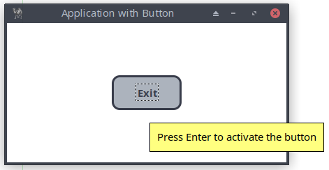
Figure 9.2: The Main Window with a Button that responds to the Enter Key and Includes a Tooltip.
9.4 Showing Alerts and Messages from Events
In the previous section, we created the MainWindow with a Button widget, where the

Figure 9.3: The Main Window with a Button, Displaying a Confirmation Messagebox
# Invoke the modules Application, Buttons, MsgBox use Prima qw(Application Buttons MsgBox); my $mw = Prima::MainWindow->new( size => [400, 200], text => 'App with Button and Messagebox', backColor => 0xFFFFFF, growMode => gm::Center, icon => Prima::Icon->load('icon.png'), ); $mw->insert( Button => size => [100, 50], text => 'Exit', backColor => 0xcccccc, default => 1, growMode => gm::Center,# The `onClick` event is now connected to the subroutine showMessage that # displays the default Prima message box before closing the window. # The reference variable $clicked_button_id stores a number associated with # the clicked button (let's say 'id'): mb::Yes corresponds with 2 and # mb::No with 8 onClick => sub { my $clicked_button_id = showMessage(); $::application->close if ($clicked_button_id == 2); } );# subroutine myMessage sub showMessage {# make a messagebox with two buttons Yes and No and a Question mark my $clicked_button_id = Prima::MsgBox::message('Exit? Sure?', mb::Yes|mb::No|mb::Question, buttons => { mb::Yes => {#text of the button that overrides the default 'Yes' text => 'Absolutely!', }, mb::No => { backColor => cl::LightGreen, color => 0xFFFFFF, }, }, ); } Prima->run;
Listing 9.2: The Main Window with a Button, Displaying a Confirmation Messagebox
Consider adding the following two properties to showMessage():
# if 1, the message box width is shrunken so that there's no empty space # on to the right. compact => 1,# defines the default button in the dialog defButton => mb::No,
For now, this is enough to know about the button widget and its properties, methods, and events.
10. Displaying Text: Labels
10.1 Labels, Captions, and Text Elements
We will now create a simple window application that generates a random number when a button is clicked. The MainWindow contains two widgets: the familiar Button and the new Label. A Label widget is a simple widget used to display static text. It is often used to provide descriptions, titles, or any non-interactive text information to users within the application. Here the
onClick => sub {
                    my $random_number = int(rand(100));
                    $label->set(text => $random_number);
               },
The reference variable
The basic setup of the MainWindow is extended by including the module Label
use Prima qw(Application Buttons Label)
The
Lastly, note that the setup of the MainWindow introduces new properties:
 borderStyle => bs::Dialog
 # preventing it from being resized;
 # we’ve also reduced the number of border icons using the property
 borderIcons => bi::SystemMenu|bi::TitleBar

Figure 10.1: The Non-resizable Main Window with a Button and Label widget
# invoke the modules Application, Buttons, Label use Prima qw(Application Buttons Label); my $mw = Prima::MainWindow->new( text => 'Random', size => [250, 200],# disable resize of the window: borderStyle => bs::Dialog,# show system menu button and/or close button (usually with icon) and # show also the title bar ('bi::TitleBar' is needed due to borderStyle) borderIcons => bi::SystemMenu|bi::TitleBar, ); my $label = $mw->insert( Label =># position widget: [x, y] origin => [110, 125], size => [50, 50], text => '', font => {size => 26}, ); $mw->insert( Button =># position widget: [x, y] origin => [50, 75], size => [150, 50], text => 'Random number!', default => 1, onClick => sub { my $random_number = int(rand(100)); $label->set(text => $random_number); }, ); Prima->run;
Listing 10.1: The Non-resizable Main Window with a Button and Label widget
10.2 Auto-Resizing and Dynamic Layout
The Label widget has some common used properties:
a. Horizontal Alignment (alignment )
This property determines how text is aligned horizontally within the widget. You can set it to one of the following constants:
ta::Left (default)ta::Center ta::Right
For example, use
b. Automatic Height Adjustment (autoHeight )
When enabled (
c. Automatic Width Adjustment (autoWidth )
When enabled (
d. Text Wrapping (wordWrap )
This property controls how text wraps within the widget:
- If disabled (
0 , default), text only wraps at explicit newline characters. - If enabled (
1 ), text wraps automatically to fit the widget’s width, ensuring all content remains visible.
e. Vertical Alignment (valignment )
This property sets the vertical alignment of text within the widget. You can choose from:
ta::Top (default)ta::Middle ta::Bottom
For example, use
For a quick overview:
| Property | Meaning | Default |
|---|---|---|
| Horizontal text alignment | ||
| Vertical text alignment | ||
| Adjust height to text | ||
| Adjust width to text | ||
| Text wraps automatically to fit the widget’s width |
Table 10.1: Main Properties
The following program demonstrates the power and flexibility of Prima's Label widget, specifically focusing on the
The Label widget in this program is initialized with specific properties:
- autoHeight set to 1, enabling the label to adjust its height automatically based on the text content (the default value is 0),
- an initial text of "line1" with a blue background and a visible border, placed at coordinates [50, 85] with a width of 300 pixels.
The Button widget titled "Add text" is included to simulate content changes. When clicked, it updates the text property to include multiple lines, triggering the autoHeight feature. As a result, the label will expand vertically to fit all lines without manually resizing it.
Notice the use of this command, which defines the width and height variables from
my ($mw_width, $mw_height) = $mw->size;

Figure 10.2: The Main Window with a Button and a Label Widget, Which Automatically Adjusts Its Height
use Prima qw(Application Label Buttons);

my $mw = Prima::MainWindow->new(

    text => 'Magic with Label's autoHeight',
    size => [400, 200],
    backColor => 0xFFFFFF,
    borderStyle => bs::Dialog,
    borderIcons => bi::SystemMenu|bi::TitleBar,
    icon => Prima::Icon->load('icon.png'),
);

my ($mw_width, $mw_height) = $mw->size;

my $label = $mw->insert( Label =>

    origin => [50,85],
    size => [($mw_width-100), 30],
    text => 'line1',
    autoHeight => 1,
    color => 0xFFFFFF,
    backColor => cl::Blue,
);

$mw->insert( Button =>

    # center the button
    origin => [($mw_width/2)-(80/2), 25],
    size => [80, 30],
    text => 'Add text',
    color => 0xFFFFFF,
    onClick => sub { $label->text("line1\nline2\nline3\nline4"); },
);

Prima->run;
Listing 10.2: The Main Window with a Button and a Label Widget, Which Automatically Adjusts Its Height
10.3. Using a Panel to Manage Text Alignment and Word Wrapping in Multi-Widget Windows
Now we build a "Tip of the Day" application. It features a main window with a custom icon, a quote display, and buttons for navigating between quotes and exiting the application.
A
# Add a panel to act as a border around the label

my $panel = $mw->insert( 'Widget::Panel' =>

    origin => [20, 60],
    size => [300, 120],
    width => 300,
    height => 120,
    ownerBackColor => 0,
    backColor => cl::LightGray,
    raise => 0,
    borderWidth => 1,
);
Inside this
$panel = $mw->insert( Label =>

    origin => [25, 70],
    size => [285, 100],
    text => $quotes{$index},
    alignment => ta::Left,
    font => { size => 8, },
    wordWrap => 1,
    backColor => cl::LightGray,
    color => cl::Black,
);
Users can cycle through quotes stored in a
onClick => sub {
                   ($index < (scalar keys %quotes)) ? $index++
                                                    : $index = 1;
                   $panel->text($quotes{$index});
               },
A custom information icon was loaded using the following code:
# Load a custom information icon my $logo = Prima::Icon->load('tip.png');# Insert the icon into the main window $mw->insert( ImageViewer => image => $logo, origin => [20, 200], size => [32, 32], );
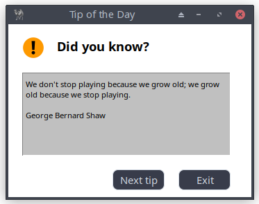
Figure 10.3: Tip of the Day Application
The complete code:
use Prima qw(Application Label Buttons ImageViewer Widget::Panel); my $mw = Prima::MainWindow->new( text => 'Tip of the Day', size => [350, 250], backColor => cl::White, color => cl::Black, icon => Prima::Icon->load('icon.png'), ); # You can load the standard info icon: # my $logo = Prima::StdBitmap::icon(sbmp::Information); # or load a custom icon my $logo = Prima::Icon->load('tip.png');# Insert the icon into the main window $mw->insert( ImageViewer => image => $logo, origin => [20, 200], size => [32, 32], ); $mw->insert( Label => text => "Did you know?", alignment => ta::Left, wordWrap => 1, origin => [70, 180], width => 250, height => 50, font => { size => 14, style => fs::Bold }, color => cl::Black, ); my %quotes = ( 1 => "We don't stop playing because we grow old; " . "we grow old because we stop playing.\n\n" . "George Bernard Shaw", 2 => "Well done is better than well said.\n\n" . "Benjamin Franklin", 3 => "Tis better to have loved and lost " . "than never to have loved at all.\n\n" . "Alfred Lord Tennyson", 4 => "For every complex problem there is an answer " . "that is clear, simple, and wrong.\n\n" . "H. L. Mencken", 5 => "If the freedom of speech is taken away " . "then dumb and silent we may be led, " . "like sheep to the slaughter.\n\n" . "George Washington", );# Add a panel to act as a border around the label my $panel = $mw->insert( 'Widget::Panel' => origin => [20, 60], size => [300, 120], width => 300, height => 120, backColor => cl::LightGray, raise => 0, borderWidth => 1, ); my $index = 1; $panel = $mw->insert( Label => origin => [25, 70], size => [285, 100], text => $quotes{$index}, alignment => ta::Left, font => { size => 8, }, wordWrap => 1, backColor => cl::LightGray, color => cl::Black, ); $mw->insert( Button => origin => [150, 10], size => [75, 30], text => "Next tip", onClick => sub { ($index < (scalar keys %quotes)) ? $index++ : $index = 1; $panel->text($quotes{$index}); }, ); $mw->insert( Button => origin => [245, 10], size => [75, 30], text => "Exit", onClick => sub { exit; }, ); Prima->run;
Listing 10.3: Tip of the Day Application
10.4 Embedding images
In the previous code, we introduced the ImageViewer module, which displayed several quotes that could be navigated using the "Next Tip" button. In this chapter, we will delve deeper into the capabilities of the ImageViewer module.
10.4.1 A simple graphical window
Let’s first create a simple graphical window, displaying an image centered both horizontally and vertically. Instead of the origin property, the more efficient pack geometry manager is used to position the image. In Part 4, we will discuss this feature in detail. For now, this will suffice:
pack => { expand => 1, fill => 'both' }
Explanation:
- expand => 1: the widget will expand to fill any extra space in the parent container.
- fill => 'both': the widget will expand both horizontally and vertically to fill the available space.
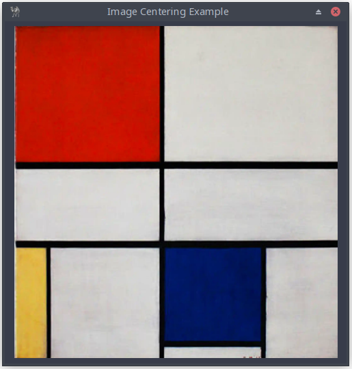
Figure 10.4: The Main Window, Presenting a Centered Image
use Prima qw(Application ImageViewer); # load the image my $image = Prima::Image->load('img/mondriaan.png') or die "Cannot load image"; my $mw = Prima::MainWindow->new( text => 'Image Centering Example', size => [500, 500], centered => 1, borderStyle => bs::Dialog, borderIcons => bi::SystemMenu|bi::TitleBar, icon => Prima::Icon->load('icon.png'), );# create an ImageViewer widget to display the image my $image_viewer = $mw->insert( ImageViewer => pack => { expand => 1, fill => 'both' },# set the loaded image* image => $image,# center the loaded image vertically valignment => ta::Center,# center the loaded image horizontally alignment => ta::Center, ); Prima->run;
Listing 10.4: The Main Window, Presenting a Centered Image
10.4.2 Adding and removing scrollbars
The easiest way to add scrollbars is by reducing the window size. Here, instead of [500, 500], we use [400, 400], and the scrollbars are automatically displayed.
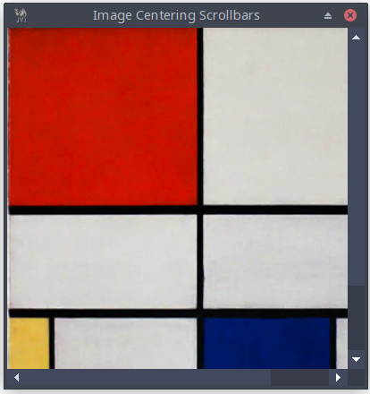
Figure 10.5: The Main Window, Presenting an Image with Scrollbars
To add scrollbars explicitly, use
vScroll => 1,
hScroll => 1,
To remove scrollbars explicitly, use
vScroll => 0,
hScroll => 0,
10.4.3 A slideshow
The following example is a simple slideshow that uses the ImageViewer, Label, and Button classes. New is the property pad in
pack => { expand => 0, fill => 'x', pad => 10, }
which simply means that a padding of 10 pixels is added around the widget.

Figure 10.6: The Main Window, Presenting a Slideshow of Images
use Prima qw(Application ImageViewer Label Buttons); my @images = ( 'img/monet_1874_sunset_on_the_seine.png', 'img/monet_1882_sunset_at_pourville.png', 'img/monet_1883_sunset_at_etretat.png', 'img/monet_1886_sunset_at_giverny.png' ); my @copy_images = @images; my @texts; my $no = 0; # extract description form filenames foreach (@copy_images) { $_ =~ s/img\// /g; $_ =~ s/_|\.png/ /g; $_ =~ s/^\s+//; $no++; $_ .= "( $no )"; $_ = ucfirst($_); push(@texts, $_); }; my $mw = Prima::MainWindow->new( text => 'Image example', size => [475, 450], centered => 1, borderStyle => bs::Dialog, borderIcons => bi::SystemMenu|bi::TitleBar, icon => Prima::Icon->load('img/icon.png'), ); my $current_index = 0; my $image = Prima::Image->load($images[$current_index]) or die "Cannot load image";# Prima::ImageViewer - image, icon, and bitmap viewer my $image_viewer = $mw->insert( ImageViewer => pack => { expand => 1, fill => 'both', pad => 0 }, image => $image, valignment => ta::Center, alignment => ta::Center, ); my $label = $mw->insert( Label => pack => { expand => 0, fill => 'x', pad => 10, }, height => 30, font => { size => 11 }, text => $texts[$current_index], alignment => ta::Center, valignment => ta::Top, ); sub show_next {# the expression ($current_index + 1) % @images is used to increment # the current index and ensure it wraps around when it reaches the # end of the @images array $current_index = ($current_index + 1) % @images; $image->load($images[$current_index]) or die "Cannot load image"; $image_viewer->image($image); $label->text($texts[$current_index]); } my $next_button = $mw->insert( Button => pack => { expand => 0, fill => 'none', pady => 20 }, width => 50, height => 30, text => ' > ', default => 1, onClick => sub { show_next(); }, ); Prima->run;
Listing 10.5: The Main Window, Presenting a Slideshow of Images
11. Layout Management Fundamentals
11.1 An Introduction to Geometry Managers
In Prima, geometry managers control how widgets are positioned within their containers. Unlike absolute positioning with the
11.2 Absolute Positioning with origin
Before exploring geometry managers, let's review the basic positioning method we've used so far:
$mw->insert( Button =>
    origin => [50, 75],
    size => [150, 50],
    text => 'Click me',
);
The
- x: horizontal position from the left edge
- y: vertical position from the bottom edge
From Chapter 10's random number example:
my $label = $mw->insert( Label => origin => [110, 125], # ... ); $mw->insert( Button => origin => [50, 75],# ... );
While simple, this approach has limitations:
- Requires manual recalculation when window size changes
- Doesn't automatically adjust to content changes
- Makes complex layouts difficult to maintain
11.3 Using the pack Geometry Manager Effectively
The pack geometry manager provides a more flexible alternative:
$container->insert( Widget => pack => { side => 'top', # Position relative to container pad => 5,# Padding around widget fill => 'x',# Fill horizontally expand => 0# Don't expand to fill space },# Other widget properties... );
Key pack options:
side: Determines widget position
- 'top' (default), 'bottom', 'left', 'right'
fill: Controls widget expansion
- 'none' (default), 'x', 'y', or 'both'
expand: Allocates extra space
- 0 (false) or 1 (true)
pad: Adds padding around widget
- Single value or [horizontal, vertical]
Example application:
$mw->insert( Button =>
    text => 'Next tip',
    pack => {
        side => 'bottom',
        pad => 10,
        fill => 'x',
    },
);

$mw->insert( Label =>
    text => $quotes{$index},
    pack => {
        side => 'top',
        pad => 5,
        fill => 'both',
        expand => 1,
    },
);
This creates a layout where:
- The label expands to fill available space
- The button stays at the bottom
- Automatic padding maintains spacing
The pack manager automatically handles window resizing and maintains the relative positions of widgets.
12. Managing User Input
12.1 InputLine Basics
The InputLine widget provides powerful single-line text input capabilities with extensive customization options. This section introduces the core properties and methods that control text input behavior.
| Property | Description |
|---|---|
| autoHeight BOOLEAN | If 1, adjusts height when font changes (Default: 1) |
| readOnly BOOLEAN | If 1, text cannot be edited (Default: 0) |
| passwordChar CHARACTER | Character shown instead of text when writeOnly=1 (Default: *) |
| writeOnly BOOLEAN | If 1, hides input showing passwordChar (Default: 0) |
| insertMode | Manages typing mode (1=insert, 0=overwrite) (Default: Toggle with Insert key) |
Table 12.1 Properties InputLine
Default methods with shortcuts:
- Copy (Ctrl+C)
- Cut (Ctrl+X)
- Delete (Del)
- Paste (Ctrl+V)
- Select all (Ctrl+A)
Here's a concise password application demonstrating InputLine properties:

Figure 12.1: Password Field with Masked Characters
use Prima qw(Application InputLine Label); my $mw = Prima::MainWindow->new( text => 'Password Demo', size => [250, 150], borderStyle => bs::Dialog, borderIcons => bi::SystemMenu|bi::TitleBar, ); # set icon if available; fastest option with minimal error handling $mw->icon(Prima::Icon->load('icon.png')) if -r 'icon.png'; $mw->insert( Label => pack => { side => 'top', pad => 10 }, text => 'Enter password:', font => { size => 12 }, ); my $password = $mw->insert( InputLine => pack => { fill => 'x', side => 'top', pad => 10 }, text => '', writeOnly => 1,# Hide actual input passwordChar => '*',# Show asterisks instead borderWidth => 2,# Thicker border font => { size => 14 },# Larger text maxLen => 20,# Limit length autoSelect => 0,# Don't select all on focus readOnly => 0,# Allow editing );# Set focus to password field $password->focused(1); Prima->run;
Listing 12.1: Password Field with Masked Characters
12.2 Validation Patterns
InputLine widgets support
The application:
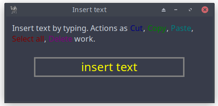
Figure 12.2: Validated Text Input with Visual Feedback
use Prima qw(Label Buttons InputLine Application); use Prima::Drawable::Markup q(M); my $mw = Prima::MainWindow->new( text => 'Insert alfabetic text', size => [425, 225], icon => Prima::Icon->load('icon.png'), ); # C<Blue|Cut> is the markup code to color the text Cut blue # see https://metacpan.org/pod/Prima::Const#cl%3A%3A-colors my $label_text = "Insert text (letters only) by typing. Actions as " . "C<Blue|Cut>, C<Green|Copy>, C<Cyan|Paste>, " . "C<Red|Select all>, C<Magenta|Delete> work."; $mw->insert( Label => pack => { fill => 'x', side => 'top', pad => 25, },# backslashs \ is necessary for markup text; alternative: the character M text => \ $label_text, wordWrap => 1, font => { size => 12, }, autoHeight => 1, ); my $input = $mw->insert( InputLine => pack => { fill => 'none', side => 'top', pad => 25 }, text => 'insert text', color => 0xFFFF00, width => 310,# ta::Left, ta::Right, ta::Center; default value: ta::Left alignment => ta::Center, font => { size => 18 },# if 1, all the text is selected when the widget becomes focused. autoSelect => 0,# width of the border around the widget; default value: depends on the skin borderWidth => 3,# The maximal length of the text, that can be stored into text or typed # by the user. Default value: 256 maxLen => 50,# no right mouse-click: see section 12.3 popupItems => [],# blink signals 'invalid' input # $_[0]->backColor(0xFF0000); sets background to red color # just for fun: enter a number... onChange => sub { my $text = $_[0]->text; if ($text =~ /[0-9]/) { $_[0]->backColor(0xFF0000);# blink when any numbers are detected $_[0]->blink; } else { $_[0]->backColor(cl::White); } }, );# set the cursor at the end $input->charOffset(length($input->text)); $input->focused(1); Prima->run;
Listing 12.2: Validated Text Input with Visual Feedback
The
A more sophisticated validation example will be discussed in Part 8: Subclassing and Overriding methods.
12.3 Working with Selection and Cursor Control
The selection property allows you to manage selected text within an InputLine widget. This is particularly useful when building applications that require text manipulation.
The
The following example demonstrates a self-assessment exercise: the user selects a word, mentally translates it into Latin, and then checks the answer. The score is tracked throughout.
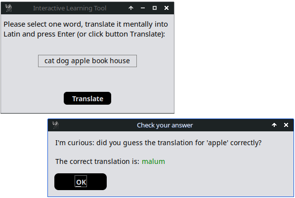
Figure 12.3: Selectable Text with Translation
use Prima qw(Application InputLine Buttons MsgBox); use Prima::Drawable::Markup q(M); # translation hash (from English to Latin for demonstration) my %translation = ( 'cat' => 'felis', 'dog' => 'canis', 'apple' => 'malum', 'book' => 'liber', 'house' => 'domus', ); my $mw = Prima::MainWindow->new( text => 'Interactive Learning Tool', size => [350, 200], icon => Prima::Icon->load('icon.png'), ); my $label_text = "Please select one word, translate it mentally into " . "Latin and press Enter (or click button Translate):"; my $label = $mw->insert( Label => pack => {fill=>'both', side => 'top', padx => 10, pady => 20}, text => $label_text, wordWrap => 1, autoHeight => 1, font => {size => 11}, ); my $input = $mw->insert(InputLine => pack => {side => 'top', pad => 40}, size => [200, 25], text => 'cat dog apple book house',# if 1, all the text is selected when the widget becomes focused autoSelect => 0,# if 1, the text cannot be edited by the user readOnly => 1, alignment => ta::Center, popupItems => [], ); my $translate_button = $mw->insert( Button => pack => {side => 'bottom', pad => 30 }, text => 'Translate', size => [100, 30], default => 1, growMode => gm::Center, onClick => sub { translate_selected_text(); }, ); sub translate_selected_text { my $message; my ($sel_start, $sel_end) = $input->selection; if ($sel_start != $sel_end) { my $selected_word = substr($input->text, $sel_start, $sel_end-$sel_start);# trim selection $selected_word =~ s/(^\s+|\s+$)//g; if (exists $translation{$selected_word}) {# Show the correct translation in a message box, the Latin word # in Green my $translation = $translation{$selected_word}; my $text = "I'm curious: did you guess the translation for " . "'$selected_word' correctly?\n\n" . "The correct translation is: C<Green|$translation>"; my $user_input = Prima::MsgBox::message_box( 'Check your answer', M $text, mb::Ok, ); } else { message_box( 'Warning!', 'Please select only one word before translating!', mb::Ok, compact => 1,); } } else { message_box( 'Warning!', 'Please select one word before translating!', mb::Ok, compact => 1,); } } Prima->run;
Listing 12.3: Selectable Text with Translation
12.4 Adding Context Menus
You can customize the right-click context menu using the
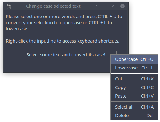
Figure 12.4: Custom Context Menu
use Prima qw(Application Label InputLine Buttons Menus MsgBox); my $mw = Prima::MainWindow->new( text => 'Change case selected text', size => [400, 200], icon => Prima::Icon->load('icon.png'), ); my $label = $mw->insert( Label => pack => {fill=>'both', side => 'top', padx => 10, pady => 20}, text => "Please select one or more words and press CTRL + U to " . "convert your selection to uppercase or CTRL + L to " . "lowercase.\n\nRight-click the inputline to access " . "keyboard shortcuts.", wordWrap => 1, autoHeight => 1, font => {size => 11}, ); my ($input, $btn); $input = $mw->insert( InputLine => pack => {fill => 'none', side => 'top', padx => 10, pady => 20}, text => 'Select some text and convert its case!', alignment => ta::Center, size => [330, 25], popupItems => [ ['Uppercase' => 'Ctrl+U' => '^U', sub{ change_case($input, "u") }], ['Lowercase' => 'Ctrl+L' => '^L', sub{ change_case($input, "l") }], [], ['Cut' => 'Ctrl+X' => '^X', sub{ $_[0]->cut }], ['Copy' => 'Ctrl+C' => '^C', sub{ $_[0]->copy }], ['Paste' => 'Ctrl+V' => '^V', sub{ $_[0]->paste }], [], ['Select all' => 'Ctrl+A' => '^A' => sub { $_[0]->select_all }], ['Delete' => 'Del' => kb::NoKey, sub{ $_[0]->delete }], ], ); sub change_case { my ($input, $case) = @_; my ($sel_start, $sel_end) = $input->selection; # only manipulate if text is selected if ($sel_start != $sel_end) {# get the entire text my $current_text = $input->text;# get the selected text my $selected_text = substr($current_text, $sel_start, $sel_end-$sel_start);# replace the selected text with its uppercase version substr($current_text, $sel_start, $sel_end - $sel_start, uc($selected_text)) if ($case eq "u"); substr($current_text, $sel_start, $sel_end - $sel_start, lc($selected_text)) if ($case eq "l");# update the InputLine with the new text $input->text($current_text); } else { Prima::MsgBox::message_box('Warning!', 'No text selected!', mb::Ok, compact => 1,); } } Prima->run;
Listing 12.4: Custom Context Menu
The
We added two new ones (uppercase and lowercase) and defined the shortcuts and actions explicitly, for example:
which associates the ‘copy’ action with a subroutine that calls the ‘copy’ method on the widget (
To assign 'Copy' to another, unnecessary shortcut Ctrl+D (D could stand for Duplicate), you could write:
12.5 Undo/Redo Built- In Features
Implementation programmatic undo/redo support is easy:
popupItems  => [
                   ['Undo' => 'Ctrl+Z' => '^Z', sub{ $_[0]->undo }],
                   ['Redo' => 'Ctrl+Y' => '^Y', sub{ $_[0]->redo }],
                ],
12.6 Numeric Spin Boxes
The program shows a combination of a inputline and a pair of arrow buttons, allowing users to input a numerical value in an intuitive way. It provides functionality to either type the number directly or adjust it incrementally by clicking the up or down arrows. This control is useful in scenarios where a bounded numerical input is required, such as temperature conversion from Fahrenheit to Celsius.
This control called SpinCtrl is part of the

Figure 12.5: Number Field with Spin Buttons
use Prima qw(Application Label Buttons Sliders);

my $mw = Prima::MainWindow->new(
    text => 'Custom Spin Control',
    size => [340, 200],
    backColor => cl::LightGray,
    icon => Prima::Icon->load('icon.png'),
    borderStyle => bs::Dialog,
    borderIcons => bi::SystemMenu|bi::TitleBar,
);

$mw->insert ( Label =>
    origin => [15, 165],
    size   => [310, 20],
    text   => 'Fahrenheit temperature to Celsius Converter',
    alignment => ta::Center,
    font   => { size => 10, style => fs::Bold },
    color  => cl::White,
    backColor => cl::Red,
);

$mw->insert ( Label =>
    origin => [15, 115],
    size   => [100, 20],
    text   => 'Fahrenheit:',
    alignment => ta::Left,
    font   => { size => 10, },
    color  => cl::Black,
);

my $inputline = $mw->insert( SpinEdit =>
    origin => [100, 115],
    width  => 75,
    min => -459,
    max => 1000,
    ownerBackColor => 0,
    editProfile => {color => cl::Black, backColor => cl::White},
    spinProfile => {backColor => cl::LightGray, color => cl::Black},
);

$mw->insert ( Label =>
    origin => [15, 40],
    size   => [60, 45],
    text   => 'Celcius:',
    alignment => ta::Left,
    font   => { size => 10, },
    color  => cl::Black,
),

my $result = $mw->insert( Label =>
    origin => [100, 40],
    size   => [60, 45],
    text   => '',
    alignment => ta::Left,
    color  => cl::Blue,
);

$mw->insert( Button =>
    origin => [70, 10],
    size => [90, 30],
    text => 'Compute',
    default => 1,
    onClick => sub { on_compute(); },
);

$mw->insert( Button =>
    origin => [180, 10],
    size => [90, 30],
    text => 'Close',
    onClick => sub { $::application->destroy() },
);

sub on_compute {
	my $fahr = $inputline->text;
    my $cels = (($fahr - 32) * 5 / 9);
    # round: 2 digits after decimal point
    my $factor = 10**2;
    $cels = int( $cels * $factor + 0.5 ) / $factor;
    $result->text($cels);
}

Prima->run;
Listing 12.5: Number Field with Spin Buttons
12.7 Built- In Color Selector
This Prima-based color selector allows users to adjust Red, Green, and Blue (RGB) values through sliders, with real-time feedback on color changes. It displays the selected color in a preview area and updates both the RGB and hexadecimal values for easy reference.
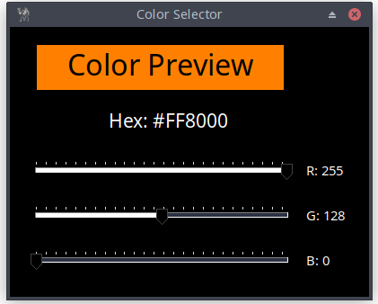
Figure 12.6: RGB Color Selection Interface
use Prima qw(Application Label Sliders); my $mw = Prima::MainWindow->new( text => 'Color Selector', size => [400, 300], backColor => cl::Black, color => cl::Black, borderStyle => bs::Dialog, borderIcons => bi::SystemMenu | bi::TitleBar, ); # Try loading icon but don't die if missing my $icon = eval { Prima::Icon->load('icon.png') }; $mw->icon($icon) if $icon; my %slider_defaults = ( size => [300, 30],# if 1, the widget is drawn vertically, and the slider moves from bottom # to top. If 0, the widget is drawn horizontally, and the slider moves # from left to right. vertical => 0,# sets the lower limit for value; default: 0 min => 0,# sets the upper limit for value; default: 100 max => 255,# selects an integer value between min and max and the corresponding # sliding bar position value => 128,# if 1, the parts of the shaft are painted with different colors to # increase visual feedback. If 0, the shaft is painted with the single # default background color ribbonStrip => 1, onChange => sub { update_color() }, ); my $color_display = $mw->insert( Label => text => 'Color Preview', origin => [30, 230], size => [275, 50], alignment => ta::Center, backColor => cl::White, font => { size => 24 }, ); my $hex_display = $mw->insert( Label => text => 'Hex: #808080', origin => [110, 180], size => [360, 30], alignment => ta::Left, font => { size => 16 }, color => cl::White, ); my %label_defaults = ( size => [50, 30], color => cl::White );# Create RGB sliders and labels my @slider_labels = ( ['R', 120], ['G', 70], ['B', 20] ); my @sliders; my @labels; foreach my $color_data (@slider_labels) { my ($label, $y) = @$color_data; push @sliders, $mw->insert( Slider => origin => [20, $y], %slider_defaults, ); push @labels, $mw->insert( Label => text => "$label: 128", origin => [330, $y], %label_defaults, ); }# convert RGB values to packed 24-bit color integer # format: 0xRRGGBB where RR=red, GG=green, BB=blue sub RGB {# shift red 16 bits left, green 8 bits left, keep blue in lowest 8 bits ($_[0] << 16) | ($_[1] << 8) | $_[2] } sub update_color { my @vals = map { $_->value } @sliders; # (r, g, b) values 0-255 my ($r, $g, $b) = @vals;# set preview background using packed RGB value $color_display->backColor( RGB($r, $g, $b) );# format RGB values as 2-digit hex for display my $hex = sprintf("#%02X%02X%02X", $r, $g, $b); $hex_display->text("Hex: $hex");# update each label with its corresponding color value for my $i (0 .. $#labels) { $labels[$i]->text("$slider_labels[$i][0]: $vals[$i]"); } } update_color(); Prima->run;
Listing 12.6: RGB Color Selection Interface
13. Selection Widgets
13.1 Radio Buttons
Allows users to select one option from a set of mutually exclusive choices. Appears in sets of two or more, with each option represented by a small circle and label; a filled circle indicates the selected option. Ideal for forms, settings, or tests requiring a single selection.
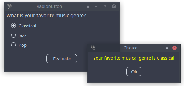
Figure 13.1: Application with Radio Buttons
use Prima qw(Application Buttons Label MsgBox); use Prima::Drawable::Markup q(M); my $mw = Prima::MainWindow->new( text=> 'Radiobutton', size => [375, 200], icon => Prima::Icon->load('icon.png'), ); $mw->insert( Label => pack => {fill => 'x', side => 'top', pad => 10}, text => 'What is your favorite music genre?', font => {size => 12,}, ); my $choice; my $grp = $mw->insert( GroupBox => text => '', origin => [20,70], onRadioClick => sub { $choice = $_[1]->text; } ); # fill => 'x', expand => 1 to align the radiobuttons $grp->insert( Radio => pack => {side => 'top', fill => 'x', expand => 1}, text => $_) for (qw(Classical Jazz Pop));# check the first option* $grp->index(0); $mw->insert( Button => pack => { fill => 'none', side => 'bottom', pad => 50 }, size => [100, 30], text => 'Evaluate', onClick => sub { message_box( 'Choice', M "C<Yellow|Your favorite musical genre is $choice>", mb::Ok, compact => 1, ); } ); Prima->run;
Listing 13.1: Application with Radio Buttons
Tips:
- Replace
origin => [20,70] bypack => {side => 'top',} to center the radiobuttons. - To add a tooltip to radio buttons, use the
hint property. This property lets you define a text message that appears when users hover over the widget. Tooltips are useful for providing additional context or guidance, for example:
$grp->insert( Radio =>
    pack => { side => 'top', fill => 'x', expand => 1},
              text => 'Classical', hint => 'Bach, Brahms, Bruckner');
$grp->insert( Radio =>
    pack =>
       {side => 'top', fill => 'x', expand => 1}, text => $_) for qw(Jazz Pop);
13.2 Checkboxes
A Checkbox allows users to make a binary choice, such as yes/no or true/false. It includes a small box with a label, where a check mark appears when the option is chosen. If the box is empty, the option is unselected. Checkboxes are commonly used in forms or settings to enable options or toggle features on and off.
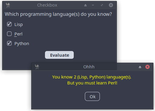
Figure 13.2: Application with Checkboxes
use Prima qw(Application Buttons Label MsgBox); my $mw = Prima::MainWindow->new( text=> 'Checkbox', size => [375, 200], icon => Prima::Icon->load('icon.png'), ); my $counter = 0; sub EventHandler { my ($var) = @_; ($var->checked) ? $counter++ : $counter--; } $mw->insert( Label => pack => { fill => 'x', side => 'top', pad => 10 }, text => 'Which programming language(s) do you know?', autoHeight => 1, font => { size => 12, }, ); my($chk_lisp, $chk_perl, $chk_python); $chk_lisp = $mw->insert( CheckBox => pack => { fill => 'x', side => 'top', padx => 25 }, text => 'Lisp', onClick => sub { EventHandler($chk_lisp); }, # hint displays a tooltip when the mouse pointer is hovered over the # widget longer than some timeout, until the pointer is drawn away. hint => "I like Lisp, \nespecially the dialect newLisp!", ); $chk_perl = $mw->insert( CheckBox => pack => { fill => 'x', side => 'top', padx => 25 },# the character after ~ (tilde) character, is treated as a hot key, # and the character is underlined. If the user presses the corresponding # character key then Click event is called text => '~Perl', onClick => sub { EventHandler($chk_perl); },# right mouse click! popupItems => [ ['Perl is a powerful, feature-rich programming language developed over 30 years.' => ''] ], ); $chk_python = $mw->insert( CheckBox => pack => { fill => 'x', side => 'top', padx => 25 }, text => "Python", onClick => sub { EventHandler($chk_python); }, ); $mw->insert( Button => pack => { fill => 'none', side => 'top', pad => 15 }, size => [100, 30], text => 'Evaluate', backColor => 0xcccccc, color => 0x000000,# user can press the enter key default => 1, growMode => gm::Center, onClick => sub { my @checked_options;# check the state of each checkbox push (@checked_options, $chk_lisp->text) if $chk_lisp->checked; push (@checked_options, substr($chk_perl->text, 1)) if $chk_perl->checked; push (@checked_options, $chk_python->text) if $chk_python->checked;# print the result based on the checked options if (@checked_options) { my $str = $counter . " (" . join(", ", @checked_options) . ")"; message_box('Ohhh', "You know $str language(s). \n But you must learn Perl!", mb::Ok, compact => 1,) if (! $chk_perl->checked); message_box('Congratulations', "You know $str language(s). \n\n Indeed, Perl is a great language!", mb::Ok, compact => 1,) if ($chk_perl->checked); } else { message_box('Ahhh', "No options selected", mb::Ok, compact => 1,); } } ); Prima->run;
Listing 13.2 Application with Checkboxes
13.3 Combo Boxes
If you are giving the user a small list of choices then stick with the radiobuttons. However, use the combobox for long lists. A user can select one option. I prefer the type of combobox with an instruction inside as a header.
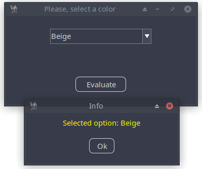
Figure 13.3: Application with Combobox
use Prima qw(Application Label Buttons ComboBox MsgBox); my $mw = Prima::MainWindow->new( text=> 'Combobox', size => [375, 175], icon => Prima::Icon->load('icon.png'), skin => 'flat', ); # If the collection in a combo box is long enough, a scroll bar will # appear to accommodate it. my $combo = $mw->insert( ComboBox => pack => { fill => 'none', side => 'top', pad => 50 }, size => [200, 30], name => 'Please, select a color', items => [ 'Apricot', 'Beige', 'Black', 'Blue', 'Brown', 'Cyan', 'Green', 'Grey', 'Lavender', 'Lime', 'Magenta' ],# select first item text => 'Apricot',# the combo box should function as a drop-down list: you can type # in your own text, in addition to selecting items from the drop-down. style => (cs::DropDownList), ); $mw->insert( Button => pack => {fill => 'none', side => 'bottom', pad => 50}, size => [100, 30], text => 'Evaluate', onClick => sub { message_box("Info", "Selected option: " . $combo->text, mb::OK, compact => 1); } ); Prima->run;
Listing 13.3: Application with Combobox
13.4 List Boxes
If you are giving the user a small list of choices then stick with the checkbox. However, use the listbox for long lists. A user can select one or more options.
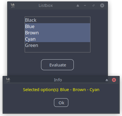
Figure 13.4: Application with Listbox
use Prima qw(Application Buttons Label MsgBox ComboBox); my $mw = Prima::MainWindow->new( origin => [100, 100], size => [300, 200], # designScale: width and height of the font when designed, # transformed in proportion between the designed and the # actual font metrics, to avoid garbled windows on different systems designScale => [7, 16], text => "Listbox", icon => Prima::Icon->load('icon.png'), ); my $list = $mw->insert( ListBox => name => 'ListBox1', origin => [50, 80], size => [200, 100],# if 0, the user can select only one item multiSelect => 1,# if 1, the user can drag mouse or use Shift key plus arrow keys to # perform range selection; # the Control key can be used to select individual items. extendedSelect => 1, font => {size => 12}, items => [ 'Black', 'Blue', 'Brown', 'Cyan', 'Green' ], align => ta::Left, ); $mw->insert( Button => origin => [100, 30], size => [100, 30], text => 'Evaluate', onClick => sub { my $SelectedOptions = ""; foreach (@{ $list->selectedItems }){ if ($SelectedOptions eq "") { $SelectedOptions = $list->items->[$_];# alternative: $SelectedOptions = $list->{items}[$_]; # alternative: $SelectedOptions = $list->{items}->[$_]; } else { $SelectedOptions = join (" - ", $SelectedOptions, $list->items->[$_]);# alternative: # $SelectedOptions = join (" - ", $SelectedOptions, # $list->{items}[$_]); # alternative: # $SelectedOptions = join (" - ", $SelectedOptions, # $list->{items}->[$_]); } }; $SelectedOptions = "no selection!" if (! $SelectedOptions); message_box('Info', "Selected option(s): " . $SelectedOptions, mb::Ok, compact => 1,); } ); Prima->run;
Listing 13.4: Application with Listbox
13.5 CheckLists
In this example, you'll learn how to create a simple checklist application using the
This is ideal for applications that offer a wide range of customizable settings.
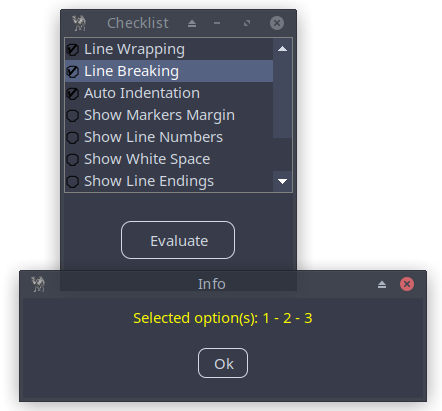
Figure 13.5: Application Featuring Checklist
use Prima qw(ExtLists Application Buttons Label MsgBox); my $mw = Prima::MainWindow->new( size => [ 200, 200], # Ensures consistent widget scaling across different screen # resolutions and DPIs designScale => [7,16], text => "Checklist", icon => Prima::Icon->load('icon.png'), ); my @items = ('Line Wrapping', 'Line Breaking', 'Auto Indentation', 'Show Markers Margin', 'Show Line Numbers', 'Show White Space', 'Show Line Endings', 'Show Message Window', 'Show Tool Bar', 'Show Side Bar');# Initialize the bit vector with items 1, 3, 5, and 7 checked my $v = '';# Item 1 checked vec($v, 0, 1) = 1;# Item 3 checked vec($v, 2, 1) = 1;# Item 5 checked vec($v, 4, 1) = 1;# Item 7 checked vec($v, 6, 1) = 1;# or in one statement: vec($vec, 0, 8) = 0x55; The hexadecimal # value 55 is 01010101 in binary. # this means that alternating bits (1, 3, 5, 7) are set to 1, # while bits (2, 4, 6, 8) are set to 0. # alternatively, using binary directly: $v = pack("B*", '01010101'); my $checklist= $mw->insert( CheckList => pack => { fill => 'both', expand => 1}, items => \@items,# initial bit vector vector => $v, ); $mw->insert( Button => pack => { fill => 'none', side => 'top', expand => 1}, size => [100, 30], text => 'Evaluate',# event handler for when an item is clicked onClick => sub { my $selected = ''; for(my $i = 0; $i < scalar(@items); $i++) {# get the updated vector after the click event: $checklist->vector # get the bit value: vec($checklist->vector, $i, 1) where 1 # if checked, 0 if unchecked $selected .= ($selected ? ' - ' : '') . ($i + 1) if ( vec($checklist->vector, $i, 1) ); } $selected = "no selection!" if (! $selected); message_box('Info', "Selected option(s): " . $selected, mb::Ok, compact => 1,); } ); Prima->run;
Listing 13.5: Application Featuring Checklist
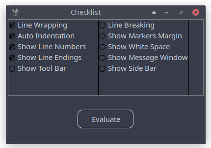
Figure 13.6: Application Featuring Checklist and multicolumn => 1
Add
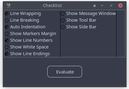
Figure 13.7: Application Featuring Checklist and multicolumn => 1 and vertical => 1
13.6 Draggable Items in Lists
KnowledgeSorter is an educational app that challenges users to arrange items in the correct order, making it perfect for subjects like history, science, programming, and more. This can be easily implemented in Prima by using the
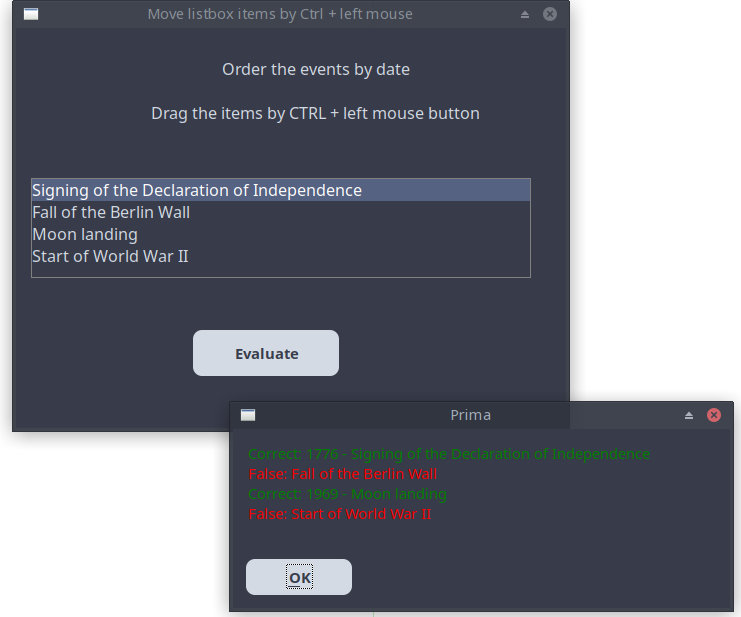
Figure 13.8: Application Using the Draggable Property in the ListBox Widget
use Prima qw(Application Buttons Label ComboBox MsgBox); use Prima::Drawable::Markup q(M); my $mw = Prima::MainWindow->new( text => 'Move listbox items by Ctrl + left mouse', size => [530, 400], font => { size => 12, }, borderStyle => bs::Dialog, borderIcons => bi::All & ~bi::Maximize, ); my $in = $mw->insert( Label => origin => [15, 300], size => [500, 70], text => "Order the events by date\n\n Drag the items by CTRL + left mouse button", alignment => ta::Center, autoHeight => 1, ); my $lb = $mw->insert( ListBox => origin => [15, 150], size => [500, 100], font => { size => 12}, items => [ 'Fall of the Berlin Wall', 'Signing of the Declaration of Independence', 'Moon landing', 'Start of World War II' ], draggable => 1, align => ta::Left, ); $mw->insert( Button => origin => [175, 50], size => [150, 50], text => 'Evaluate', default => 1, onClick => sub { check_order($lb); }, ); sub check_order { my @arr = @{ $lb->items}; my $str = ''; # colored text by C<color|text> # read https://metacpan.org/pod/Prima::Drawable::Markup ($arr[0] eq "Signing of the Declaration of Independence") ? $str .= "C<Green|Correct: 1776 - $arr[0]\n" : $str .= "C<LightRed|False: $arr[0]\n"; ($arr[1] eq "Start of World War II") ? $str .= "C<Green|Correct: 1939 - $arr[1]\n" : $str .= "C<LightRed|False: $arr[1]\n"; ($arr[2] eq "Moon landing") ? $str .= "C<Green|Correct: 1969 - $arr[2]\n" : $str .= "C<LightRed|False: $arr[2]\n"; ($arr[3] eq "Fall of the Berlin Wall") ? $str .= "C<Green|Correct: 1989 - $arr[3]\n" : $str .= "C<LightRed|False: $arr[3]\n"; $str .= ">\n";# https://metacpan.org/pod/Prima::MsgBox # message displays 'Prima' as the window title message( M "$str", mb::Ok); } Prima->run;
Listing 13.6: Application Using the Draggable Property in the ListBox Widget
Study the alternative code of sorting-quiz.pl, which you can find in the
Closing Words
In this part, you learned the essential widgets that form the heart of any Prima application - buttons, labels, text inputs, and selection tools. You also discovered how to lay out these elements cleanly and how to make them interactive and user-friendly.
With these fundamentals, you can now build interfaces that respond to user actions, display information clearly, and guide input in reliable ways. These widgets are the core vocabulary of every larger application you will create.