 Download PDF
Part 7 - Advanced Customization
You’ve built windows, buttons, and labels - now it’s time to supercharge your Prima apps. In Part 7, you’ll learn how to:
- Create custom widgets that inherit styles automatically.
- Design interactive tables with sorting, multi-selection, and dynamic updates.
- Load and export data from files, turning your UI into a data powerhouse.
By the end, you’ll be crafting apps that look and feel professional - and you’ll have the tools to tackle even bigger projects. Ready? Let’s dive in!
18. Custom Widgets Through Composition and Inheritance
Want your widgets to automatically match your app’s colors and fonts? Or need reusable components that save you time and keep your UI consistent?
In this chapter, you’ll learn how to use inheritance and composition in Prima to:
- Automatically sync widget styles with
ownerColor andownerBackColor . - Create custom widget classes with default properties for reusable, uniform designs.
- Mimic inheritance for other properties, like enabling/disabling widgets dynamically.
By the end, you’ll be able to build cleaner, more maintainable GUIs without repetitive code.
So: Build Smarter, Not Harder
18.1 Understanding ownerColor and ownerBackColor
Here's an example that demonstrates the use of both

Figure 18.1: Properties ownerColor and ownerBackColor
Click the button 'Inherited Colors Button' and the result is:
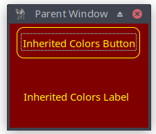
Figure 18.2: Properties ownerColor and ownerBackColor
use Prima qw(Application Label Buttons); # Create the main window, i.e. parent widget my $mw = Prima::MainWindow->new( text => 'Parent Window', size => [200, 150],# Background color for the main window color => cl::LightBlue,# Foreground (text) color for the main window backColor => cl::Green, icon => Prima::Icon->load('icon.png'), borderStyle => bs::Dialog, borderIcons => bi::SystemMenu|bi::TitleBar, );# Create a child label that inherits both background and # foreground colors from the parent my $child_label = $mw->insert( Label => origin => [20, 30], text => 'Inherited Colors Label',# Use the parent's background color ownerBackColor => 1,# Use the parent's text color ownerColor => 1, );# Create another child widget (Button) with ownerBackColor and # ownerColor enabled my $child_button = $mw->insert( Button => origin => [10, 100], text => 'Inherited Colors Button',# Use the parent's background color ownerBackColor => 1,# Use the parent's text color ownerColor => 1, );# Change parent colors on click to demonstrate automatic color inheritance $child_button->onClick( sub {# Change parent's background color $mw->color(cl::Yellow);# Change parent's foreground (text) color $mw->backColor(cl::Red); } ); Prima->run;
Listing 18.1: Properties ownerColor and ownerBackColor
The properties
18.2 Creating Reusable Widget Classes with Defaults
a. Copy properties from the parent when creating the child
You can copy properties from the parent to child widgets when they are created.
my $child_button = $mw->insert( Button =>
    text  => 'Copied Properties Button',
    # copy parent's color on initialization
    color => $mw->color,
);
This isn’t dynamic (changes won’t automatically update), but it can be useful for setting initial states.
b. Simulate inheritance with manual propagation
If you want a parent to propagate a property to all children (e.g.,
# Function to propagate 'enabled' status to all children sub propagate_enabled { my ($parent) = @_; my $enabled_status = $parent->enabled; foreach my $child ($parent->widgets) { $child->enabled($enabled_status); } }# Main window with onClick event to toggle enabled status $main_window->onClick(sub {# Toggle enabled status $main_window->enabled(!$main_window->enabled);# Apply to all children propagate_enabled($main_window); });
c. Best method: define a custom widget class with defaults
However, the best approach is to define a custom class that extends a Prima widget (such as
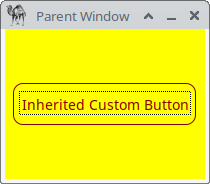
Figure 18.3: Custom Button Class
Define a separate class and save the following code into
package MyCustomButton; use Prima::Buttons; use base 'Prima::Button'; sub profile_default { # Get the default profile from the parent class (Prima::Button) # and then override only the parts we want to change. # # %default contains all inherited settings, so we don’t lose # important initialization done by Prima::Button. We simply add: # - a custom default text color (color) # - ownerBackColor / ownerColor == 1 so the button uses the # owner's background/foreground when drawing. # # This ensures the custom widget behaves like a regular button # but with our preferred default appearance. my %default = %{ $_[ 0 ]->SUPER::profile_default }; return { %default, color => cl::LightGreen, ownerBackColor => 1, ownerColor => 1,# Add more defaults if you want: # font => { size => 12, style => fs::Bold }, # centered => 1, }; }# Don’t forget this! 1;
Listing 18.2: Custom Button Class
This class acts like 'a normal
use Prima qw(Application);
use lib '.';
# including the class MyCustomButton
require "my_custom_button.pl";

my $mw = Prima::MainWindow->new(
    text => 'Parent Window',
    size => [200, 150],
    color => cl::Red,
    backColor => cl::Yellow,
    icon => Prima::Icon->load('icon.png'),
    borderStyle => bs::Dialog,
    borderIcons => bi::SystemMenu|bi::TitleBar,
);

my $custom_button = $mw->insert('MyCustomButton' =>
    centered => 1,
    text => 'Inherited Custom Button',
);

Prima->run;
Listing 18.3: Invoke Custom Class With require
If we set in
ownerBackColor => 0,
ownerColor => 0,
then the result is as expected: LightGreen text color and default system default background.
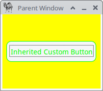
Figure 18.4: Got No Colors from Parent
To summarize, a custom class gives you:
- Reusable default properties
- Inheritable color behavior
- Uniform style across your app
- Cleaner code in your main program
19. Working with Table Widgets
19.1 Grid Widget Overview
19.2 Basic example
This Perl program creates a simple GUI window, which displays a 2×3 grid with fixed-size cells, where each cell contains a value, and the first cell in the first row is focused by default. The default font is applied to the grid.

Figure 19.1: Grid
use Prima qw(Grids Label Application); my $mw = Prima::MainWindow->new( text => 'Grid', size => [320, 250], font => { size => 11, }, icon => Prima::Icon->load('icon.png'), ); my $grid = $mw->insert ( Grid => origin => [10, 10], size => [470,175], ownerFont => 1, # Grid uses the window font columns => 3,# Number of columns in the grid constantCellHeight => 30,# All rows have fixed height = 30 constantCellWidth => 100,# All columns have fixed width = 100 allowChangeCellHeight => 0,# Disallow resizing of rows allowChangeCellWidth => 0,# Disallow resizing of columns cells => [ [qw(1.1 1.2 1.3)],# Row 0 with 3 cells [qw(2.1 2.2 2.3)],# Row 1 with 3 cells ], gridColor => cl::White,# Color grid lines (default cl::Black) focusedCell => [0,1],# Cell initially focused: row 0, column 1 (second cell) ); Prima->run;
Listing 19.1: Grid
19.3 Adding & Removing Rows and Columns
Adding or deleting a row or column can be easily achieved using four built-in functions.
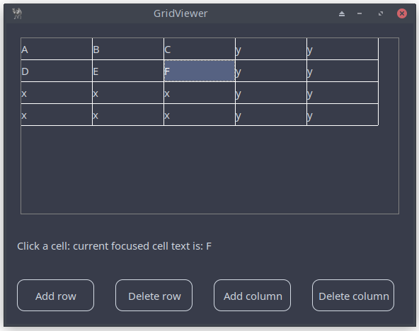
Figure 19.2: Grid With Extra Functionality
| Function | Description | Example |
|---|---|---|
| Accepts an array of strings (or list) representing a single column. Appends the column to the end of the existing columns. | ||
| Accepts an array of strings (or list) representing a single row. Appends the row to the end of the existing rows. | ||
| Removes |
||
| Removes |
Table 19.1: 4 Useful Grid Functions
use Prima qw(Grids Label Buttons Application); my $mw = Prima::MainWindow->new( text => 'GridViewer', size => [575, 425], font => { size => 11, }, icon => Prima::Icon->load('icon.png'), ); my $label; my $grid = $mw->insert ( Grid => pack => { fill => 'x', side => 'top', pad => 40 }, size => [525,250], ownerFont => 1, columns => 3, cells => [ [qw(A B C)], [qw(D E F)], ], constantCellHeight => 30, constantCellWidth => 100, allowChangeCellHeight => 0, allowChangeCellWidth => 0, # default cl::Black gridColor => cl::White,# row 0, column 0, i.e. [0, 0] is focused by default, now [0, 1] focusedCell => [0, 1], onSelectCell => sub { $label->text("Click a cell: current focused cell text is: " . $_[0]->get_cell_text($_[0]->focusedCell) ); }, ); $label = $mw->insert( Label => pack => { fill => 'x', side => 'top', pad => 30 }, text => "Click a cell: current focused cell text is: " . $grid->get_cell_text($grid->focusedCell) , );# four buttons with some onClick actions # default geometry settings for the four buttons my %mcPack = (pack => { fill => 'x', side => 'left', pad => 30 } ); $mw->insert( Button => %mcPack, text => "Add row", onClick => sub { my @array = ('x') x $grid->columns; $grid->add_row(@array); }, ); $mw->insert( Button => %mcPack, text => "Delete row", hint => "Delete last row", onClick => sub {# delete last row $grid->delete_rows($grid->rows-1,1) if ($grid->rows > 0); }, ); $mw->insert( Button => %mcPack, text => "Add column", onClick => sub { my @array = ('y') x $grid->rows; $grid->add_column(@array); }, ); $mw->insert( Button => %mcPack, text => "Delete column", hint => "Delete last column", onClick => sub {# delete last column $grid->delete_columns($grid->columns-1,1) if ($grid->columns > 0); }, ); Prima->run;
Listing 19.2 : Grid With Extra Functionality
The other methods on adding and removing rows and columns are well-documented - give them a try! Next section on multiselection and processing the cell data.
19.4 Multi-Selection and Dynamic Updates
This small application shows a grid where you can select multiple cells and toggle their case with a button. The window displays a 3×2 grid filled with letters. Simply click and drag to select one or more cells, then press “Toggle case selection” to switch lowercase letters to uppercase and vice versa.
The script features a main window containing a grid widget that supports multiselection (
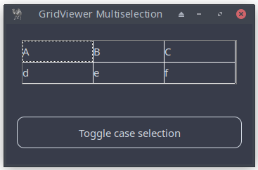
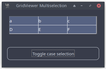
Figure 19.3: Grid With Extra Functionality
use Prima qw(Application Buttons Grids); my $mw = Prima::MainWindow->new( text => 'GridViewer Multiselection', size => [350, 200], font => { size => 11, }, icon => Prima::Icon->load('icon.png'), ); my $grid = $mw->insert( Grid => pack => { expand => 1, fill => 'none', pad => 30 }, size => [306,63], columns => 3, cells => [ [qw(A B C)], [qw(d e f)], ], constantCellHeight => 30, constantCellWidth => 100, allowChangeCellHeight => 0, allowChangeCellWidth => 0, multiSelect => 1, gridColor => cl::White, ); $mw->insert( Button => pack => { expand => 1, fill => 'x', side => 'bottom', pad => 30 } , text => "Toggle case selection", onClick => sub { # Retrieve the selection bounds: top-left (x1, y1) and # bottom-right (x2, y2) my ($x1, $y1, $x2, $y2) = $grid->selection; return print "No cells selected\n" if $x1 < 0; for ( my $x = $x1; $x <= $x2; $x++) { for ( my $y = $y1; $y <= $y2; $y++) {# Retrieve the current value of the cell # at position (x, y). my $cell = $grid->cell($x, $y); $grid->cell($x, $y, ($cell =~ /^[a-z]$/) ? uc($cell) : lc($cell) ); } }# Refresh the grid to display the updated cell values $grid->repaint; } ); Prima->run;
Listing 19.3: Grid With Extra Functionality
20. DetailedList Widgets
20.1 Understanding DetailedList
Multiple columns: each entry can have multiple fields, displayed across columns.
Customizable cells: each cell can contain different types of data and support custom rendering.
Sorting: allows sorting of rows.
Selectable rows: users can select one or more rows
This widget is often used in applications where users need to view, sort, and interact with structured data in a visually organized way.
A basic example:
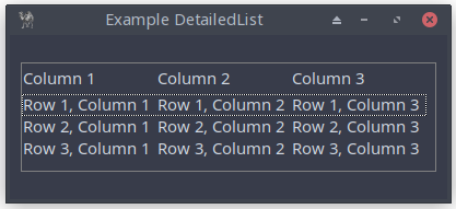
Figure 20.1: DetailedList
20.2 Building Your First DetailedList Interface
How to build the DetailedList application introduced previously and how to cutomize it? Let’s go step by step in the following sections, asking questions and finding answers as we progress.
We'll need properties for:
- displaying items in columns
- showing column headers
along with a first instruction on how to use the application.
Well, the https://metacpan.org/pod/Prima::DetailedList is fully clear, how to do that:
| Property | Description |
|---|---|
| items (ARRAY) | An array of scalar arrays (default: strings). Data flows left to right, top to bottom. |
| columns (INTEGER) | Defines the number of columns in items. If changed, both items and headers are restructured. Default: 0 |
| headers (ARRAY) | An array of strings for column titles in the header widget. |
Table 20.1: Some Properties DetailedList
The instruction is placed in a Label class, which displays a static message explaining that you can click on the column header to sort.
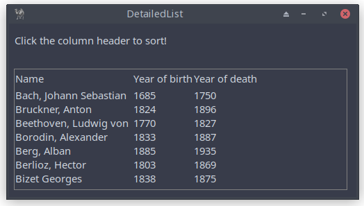
Figure 20.2: DetailedList
use Prima qw(DetailedList Label Application); my $mw = Prima::MainWindow->new( text => 'DetailedList', size => [500, 250], font => { size => 11, }, icon => Prima::Icon->load('icon.png'), ); $mw->insert( Label => pack => { side => 'top', fill => 'x', pady => 30 }, # instruction text text => " Click the column header to sort!", alignment => ta::Left, ownerFont => 1, ); my $d_list = $mw->insert( 'Prima::DetailedList' => pack => { side => 'left', fill => 'none', pad => 15 }, size => [480,175],# manages the number of columns in items columns => 3,# an array of strings passed to the header widget as column titles headers => [ 'Name', 'Year of birth', 'Year of death' ],# an array of arrays of scalars of any kind (string are assumed) items => [ ['Bach, Johann Sebastian', 1685, 1750], ['Bruckner, Anton', 1824, 1896], ['Beethoven, Ludwig von', 1770, 1827], ['Borodin, Alexander', 1833, 1887], ['Berg, Alban', 1885, 1935], ['Berlioz, Hector', 1803, 1869], ['Bizet Georges', 1838, 1875], ], ); Prima->run;
Listing 20.1: DetailedList
20.3 Customizing Columns and Headers
Upon reviewing the previous example, one might have suggestions to gave it a better look for header and items. Well, reading https://metacpan.org/pod/Prima::DetailedList gaves you information on its customizing (via headerClass and headerProfile – see 20.5) but also implicitly important additional information:
- Prima::DetailedList is a descendant of Prima::ListViewer and as such also provides a certain level of abstraction. It overloads the format of items in order to support multi-column ( 2D ) cell span.
- Prima::DetailedList also inserts Prima::Widget::Header widget on top of the list so that the user can interactively move, resize, and sort the content of the list. In other words, it is a controlling header widget
This means that a lot of properties and methods are inherited. Let’s have a look at Prima::ListViewer . As we look at https://metacpan.org/release/KARASIK/Prima-1.74/source/Prima/Lists.pm , it inherits from its parent Prima::AbstractListViewer which in turn inherits from
- Prima::Widget
- Prima::Widget::Fader
- Prima::Widget::GroupScroller
- Prima::Widget::ListBoxUtils
- Prima::Widget::MouseScroller
20.3.1 Customizing the Header
When we look at Section 20.4 and 20.5 on customizing the header, we now know where to focus:
1. Prima::DetailedList
| Property | Description | Default Value |
|---|---|---|
| headerClass | Assigns the header class. | |
| headerProfile | Assigns a hash of properties passed to the header widget during creation. | N/A (depends on values) |
Table 20.2: Header Properties of Class DetailedList
Note:
2. Prima::Widget::Header
| Property | Type | Description | Default Value |
|---|---|---|---|
| clickable | BOOLEAN | Selects if the user is allowed to click the tabs. | 1 |
| draggable | BOOLEAN | Selects if the user is allowed to move the tabs. | 1 |
| pressed | INTEGER | Contains the index of the currently pressed tab. |
-1 |
| scalable | BOOLEAN | Selects if the user is allowed to resize the tabs. | 1 |
| widths | ARRAY | Array of integer values corresponding to the extents of the tabs (widths or heights depending on |
N/A |
Table 20.3: Header Properties and Methods of Class Widget::Header
Excluded for readability:
20.3.2 Customizing the Items
When we look at Section 20.6 on customizing the items, we also know where to focus:
1. Prima::AbstractListViewer
| Property | Type | Description | Default Value |
|---|---|---|---|
| autoHeight | BOOLEAN | If 1, adjusts item height automatically when the widget’s font changes. Useful for text items. | 1 |
| count | INTEGER | The number of items in the list. Often read-only in descendants. | - |
| draggable | BOOLEAN | If 1, allows items to be dragged interactively using Ctrl + left mouse button. | 0 |
| drawGrid | BOOLEAN | If 1, vertical grid lines between columns are drawn. | 0 |
| extendedSelect | BOOLEAN | Controls multi-selection behavior when |
0 |
| focusedItem | INDEX | Index of the focused item. |
-1 |
| gridColor | COLOR | Color used for vertical divider lines in multi-column lists. | |
| multiSelect | BOOLEAN | If 0, only one item can be selected. If 1, multiple items may be selected. | 0 |
| selectedCount | INTEGER | Read-only; returns the number of selected items. | - |
| selectedItems | ARRAY | Array of integer indices for selected items. | - |
Table 20.4: Properties of Class AbstractListViewer
Excluded for readability:
2. Prima::ListViewer
| Property | Type | Description | Default Value |
|---|---|---|---|
| autoWidth | BOOLEAN | Recalculates item width automatically when the font or item list changes. | 1 |
| count | INTEGER | Read-only; returns number of items. | N/A |
| items | ARRAY | Accesses the storage array of items. Format not defined—treated as one scalar per index. | N/A |
Table 20.5: Properties of Class ListViewer
20.4 Sorting, Alignment, and Spacing
Upon reviewing the previous example in 20.2, one might have the following suggestions:
- the column headers could have more space
- sorting should be applied to the first column.
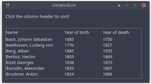
Figure 20.3: DetailedList Class with Header Modifications, Left-Aligned, and Sorted Items
use Prima qw(DetailedList Label Application); my $mw = Prima::MainWindow->new( text => 'DetailedList', size => [500, 250], font => { size => 11, }, icon => Prima::Icon->load('icon.png'), ); $mw->insert( Label => pack => { side => 'top', fill => 'x', pady => 30 }, text => " Click the column header to sort!", alignment => ta::Left, ownerFont => 1, ); my $d_list = $mw->insert( 'Prima::DetailedList' => pack => { side => 'left', fill => 'none', pad => 15 }, size => [480,175], # manages the number of columns in items columns => 3,# from: Prima::Widget::Header # widths ARRAY # Array of integer values, corresponding to the extents of the tabs. widths => [200, 130, 130],# an array of strings passed to the header widget as column titles headers => [ 'Name', 'Year of birth', 'Year of death' ],# an array of arrays of scalars of any kind (string are assumed) items => [ ['Bach, Johann Sebastian', 1685, 1750], ['Bruckner, Anton', 1824, 1896], ['Beethoven, Ludwig von', 1770, 1827], ['Borodin, Alexander', 1833, 1887], ['Berg, Alban', 1885, 1935], ['Berlioz, Hector', 1803, 1869], ['Bizet Georges', 1838, 1875], ],# aligns is not necessary, but here for demonstration purposes only. # an array of the ta:: align constants where each defines the column # alignment. # ta::Left, ta::Right, ta::Center aligns => [ta::Left, ta::Left, ta::Left,], );# sorts items by the column index in ascending order, in this case, "Name" (index 0). $d_list->sort(0); Prima->run;
Listing 20.2: DetailedList Class with Header Modifications, Left-Aligned, and Sorted Items
20.5 Customizing Header
Another suggestion is to make the header have a different background color and bold text.
The
Below is a table summarizing commonly used Widget properties that can be set within the
| Property | Description | Example Values |
|---|---|---|
| font | Customize font properties (name, size, style) for header text. | |
| backColor | Set the background color of the header. | |
| color | Set the text color of the header. | |
| alignment | Control the text alignment within header cells. |
Table 20.6: Header Profile Properties
Applying these properties…
headerProfile => { backColor => cl::LightGray,
                   color => 0x00003f,
                   font => { name => 'Courier New', size => 11, },
                   alignment => ta::Left
},
to source code of figure 20.4, results in the following:
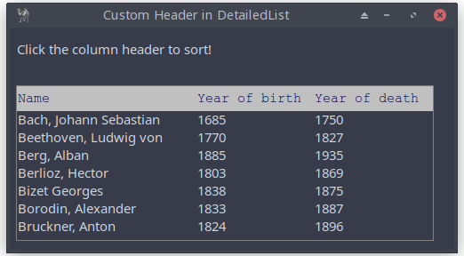
Figure 20.4: Basic Application of the DetailedList Class with Header Modifications
20.6 Customizing Items
We can add some properties from
gridColor => cl::Red,
drawGrid => 1,
and vertical grid lines between columns are drawn. In that case, you could implement:
aligns => [ta::Left, ta::Center, ta::Center,],
As already said,
A few examples of properties and methods from the class Widget, which have effect on the items of DetailedList (not the header: see next section):
# background color backColor => cl::LightGray,# text color color => cl::Blue,# if 1, the first item gets the focus current => 1,# make items not clickable enabled => 0,# add a hint message hint => "All are brilliant composers, but Bach is the best!",# click an item onMouseClick => sub { my @item = @{$_[0]->items->[$_[0]->focusedItem]}; my $str = $item[0] . " (" . $item[1] . " - " . $item[2] . ")"; showMessageDialog(400, 125, "You clicked...", "You clicked:\n\n$str") },
You’ll see the following when
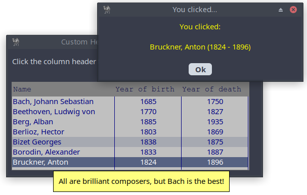
Figure 20.5: DetailedList application With Additional Features
Alternatively, you could implement:
onMouseClick => sub {
    my ($self, $index, $state) = @_;
    $index = $index->[0] if (ref $index eq 'ARRAY');
    # Ensure index is valid and proceed
    if (defined $index && $state) {

        my $str = @{$self->items->[$index]}[0] . " (" .
                  @{$self->items->[$index]}[1] . " - " .
                  @{$self->items->[$index]}[2] . ")";
        showMessageDialog(400, 125, "You clicked...",
                                                "You clicked:\n\n$str");
    }
},
20.7 headerClass property
You can use the property
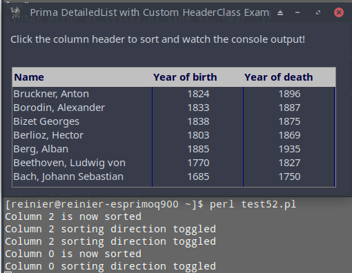
Figure 20.6: DetailedList Application with Custom Header
use Prima qw(Application Label DetailedList); # Define a custom header class package MyCustomHeader;# ... that inherits from Prima::Header use base 'Prima::Widget::Header';# Add a property to keep track of the last sorted column sub init { my $self = shift; $self->{last_sorted_column} = -1; $self->SUPER::init(@_); }# Override on_click to change column behavior on click sub on_click { my ($self, $column_index) = @_;# Toggle sorting indication if ($self->{last_sorted_column} == $column_index) { print "Column $column_index sorting direction toggled\n"; } else { print "Column $column_index is now sorted\n"; } $self->{last_sorted_column} = $column_index;# Continue with the default on_click behavior $self->SUPER::on_click($column_index); } package Main; my $mw = Prima::MainWindow->new( text => 'Prima DetailedList with Custom HeaderClass Example', size => [500, 250], font => { size => 11, }, icon => Prima::Icon->load('icon.png'), ); $mw->insert( Label => pack => { side => 'top', fill => 'x', pady => 30 }, text => " Click the column header to sort and watch the " . "console output!", alignment => ta::Left, ); $mw->insert( DetailedList => origin => [10, 10], size => [470,175],# Use MyCustomHeader as the headerClass headerClass => 'MyCustomHeader', headerProfile => { backColor => cl::LightGray, color => 0x00003f, font => { size => 11, style => fs::Bold }, alignment => ta::Left, }, columns => 3, widths => [200, 130, 130], headers => ['Name', 'Year of birth', 'Year of death'], items => [ ['Bach, Johann Sebastian', 1685, 1750], ['Bruckner, Anton', 1824, 1896], ['Beethoven, Ludwig von', 1770, 1827], ['Borodin, Alexander', 1833, 1887], ['Berg, Alban', 1885, 1935], ['Berlioz, Hector', 1803, 1869], ['Bizet Georges', 1838, 1875], ], aligns => [ta::Left, ta::Center, ta::Center,], gridColor => cl::Blue, drawGrid => 1, ); Prima->run;
Listing 20.3: DetailedList With Custom Header
20.8 Populating and Rearranging Items from a File
This script reads composer data from a CSV file and displays it in a GUI table using
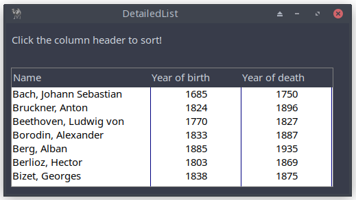
Figure 20.7: DetailedList Application Using a CSV-file
use lib '.'; use Text::CSV; #-----------------------------------------------------# # CSV file: header on line 1 and data on the next lines # ; to separate fields =begin Name;Year of birth;Year of death Bach, Johann Sebastian;1685;1750 Bruckner, Anton;1824;1896 Beethoven, Ludwig von;1770;1827 Borodin, Alexander;1833;1887 Berg, Alban;1885;1935 Berlioz, Hector;1803;1869 Bizet, Georges;1838;1875 =cut# Open CSV file my $file = 'composers.csv'; open my $fh, '<', $file or die "Could not open '$file' $!\n";# Create a CSV parser # the ; used to separate fields my $csv = Text::CSV->new({ sep_char => ";", binary => 1, auto_diag => 1 });# Arrays to hold the data my @header; my @data;# counter variable my $row_count = 0;# Parse each line of the CSV file while (my $row = $csv->getline($fh)) { if ($row_count == 0) { push(@header, $row); $row_count++; } else { push(@data, $row); } }# Close the file handle close $fh;#-----------------------------------------------------# use Prima qw(DetailedList Label Application); my $mw = Prima::MainWindow->new( text => 'DetailedList', size => [500, 250], font => { size => 11, }, icon => Prima::Icon->load('icon.png'), ); $mw->insert( Label => pack => { side => 'top', fill => 'x', pady => 30 }, text => " Click the column header to sort!", alignment => ta::Left, ownerFont => 1, ); my $d_list = $mw->insert( 'Prima::DetailedList' => pack => { side => 'left', fill => 'none', pad => 15 }, size => [470,175], columns => 3,# @header is array of strings headers => @header, widths => [200, 130, 130],# reference to @data items => \@data, backColor => 0xFFFFFF, color => 0x000000, gridColor => cl::Blue, drawGrid => 1, aligns => [ta::Left, ta::Center, ta::Center,],# move items via CTRL + Left mouse draggable => 1, ); Prima->run;
Listing 20.4: DetailedList Application Using a CSV-file
Add some functionality to export the list of items.
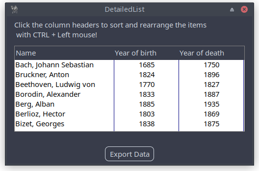
Figure 20.8: DetailedList Application With Button to Export Rearranged Data
# Step 1: Add a button to export rearranged data $mw->insert( Button => origin => [500/2-50, 5], size => [100, 30], text => 'Export Data', onClick => sub { export_rearranged_data($d_list, 'rearranged_composers.csv'); }, );# Function to export data to a CSV file sub export_rearranged_data { my ($list_widget, $filename) = @_;# Create CSV object my $csv = Text::CSV->new({ sep_char => ";", binary => 1 });# Open the file to write open my $fh, '>', $filename or die "Could not open '$filename' $!\n";# Write header $csv->print($fh, $header[0]); print $fh "\n";# Write each item in the rearranged order for my $item (@{$list_widget->items}) { $csv->print($fh, $item); print $fh "\n"; } close $fh; print "Data exported successfully to $filename\n"; }
20.9 More on sorting
The data can be sorted by clicking the column header. In some cases, it may be necessary to customize the sorting algorithm. Here’s how it can be done.
my $arr = [
    ['Philipp','30.12.1777','18.11.1840'],
    ['Catharina','1672','13.10.1745'],
    ['Georg','05.07.1843','-'],
    ['Christina','-','11.01.1785'],
    ['Andreas','08.03.1801','18.01.1835'],
];
We use the following data. Some of them are missing, some are incomplete.
my $arr = [
    ['Philipp','30.12.1777','18.11.1840'],
    ['Catharina','99.99.1672','13.10.1745'],
    ['Georg','05.07.1843','99.99.9999'],
    ['Christina','99.99.9999','11.01.1785'],
    ['Andreas','08.03.1801','18.01.1835'],
];
We want to sort on year. So, we extract the year from the data (e.g. from the second column), and use the spaceship operator (
The year can be extracted using a regex operation, as shown below:
$second_column_date = '30.12.1777';
my ($a_year) = $second_column =~ /(\d{4})$/;
To perform a numeric comparison, consider the following example:
my @years = (2020, 2015, 2022, 2018);
# Sorts numerically in ascending order
my @sorted_years = sort { $a <=> $b } @years;
The next thing we do is adding a
use Prima qw(Application DetailedList); my $mw = Prima::MainWindow->new( text => 'DetailedList Sorting Example', size => [400, 300], ); my $arr = [ ['Philipp','30.12.1777','18.11.1840'], ['Catharina','99.99.1672','13.10.1745'], ['Georg','05.07.1843','99.99.9999'], ['Christina','99.99.9999','11.01.1785'], ['Andreas','08.03.1801','18.01.1835'], ]; $mw->insert( 'DetailedList' => pack => { expand => 1, fill => 'both' }, columns => 3, headers => [ 'Name', 'Birth date', 'Death date' ], items => $arr, onSort => sub { my ($self, $column_index, $order) = @_; # If the callback procedure is willing to sort by COLUMN index, then it must # call clear_event to signal that the event flow must stop. $self->clear_event();# Debugging output print "Sorting column $column_index in order $order\n"; my @sorted_items; if ($column_index == 0) { @sorted_items = sort { $a->[0] cmp $b->[0] } @{$self->{items}}; } elsif ($column_index == 1) { @sorted_items = sort {# Extract year my ($a_year) = $a->[1] =~ /(\d{4})$/; my ($b_year) = $b->[1] =~ /(\d{4})$/;# Compare by the year in the second column $a_year <=> $b_year; } @{$self->{items}}; } elsif ($column_index == 2) { @sorted_items = sort {# Extract year my ($a_year) = $a->[2] =~ /(\d{4})$/; my ($b_year) = $b->[2] =~ /(\d{4})$/;# Compare by the year in the third column $a_year <=> $b_year; } @{$self->{items}}; }# Reverse the order if the user clicked to sort in descending order @sorted_items = reverse @sorted_items if ($order == 1);# Update the items in the DetailedList with the sorted data $self->items(\@sorted_items); }, ); Prima->run;
Listing 20.5: DetailedList Application With Button to Export Rearranged Data
Closing words
Advanced customization in Prima empowers you to:
- Create cohesive UIs with consistent styling and behavior.
- Build dynamic applications that respond to user input and data changes.
- Extend functionality by defining custom widget classes and event handlers.
Prima’s flexibility and extensibility make it a powerful tool for building desktop applications in Perl. By mastering these advanced customization techniques, you can create applications that are not only functional but also visually appealing and user-friendly.