 Download PDF
Part 8 - Extending Prima with Your Own Logic
21. Strategies for Extending Prima Applications
Prima is a flexible toolkit that’s easy to customize. Whether you're working with graphics, windows, or system tools, Prima gives you control over how things behave. You’re not locked into using everything exactly as it comes—you can build on top of it or change parts to fit your needs.
Most of this customization happens through Prima’s object-oriented interface in Perl. Perl makes it easy to add, change, or even replace methods - sometimes while your program is running. This means you can shape Prima around your application, instead of shaping your application around the toolkit.
In addition to writing your own code, you can also extend Prima using external Perl modules from CPAN. Many CPAN libraries work well alongside Prima—for example, for tasks like networking, file handling, or advanced data structures. While this chapter focuses on ways to customize Prima itself, don’t forget that CPAN is a powerful tool for adding features to your application (I’ll show you one example below).
Let’s have a look at a few simple ways to extend and modify how Prima works:
- Using Event Callbacks
This is the easiest way to customize behavior. You can respond to things like mouse clicks, key presses, or repainting a window by using event handlers such asonClick ,onKeyDown , oronPaint . - Subclassing and Overriding Methods
A more powerful technique where you create your own versions of Prima’s classes. This lets you add new features or change how something works by overriding its built-in methods. - Using Composition (Has-a Relationship)
Instead of creating a new class from an existing one, you can make your own objects that contain Prima widgets. This helps you build more flexible or reusable parts without needing inheritance. - Mixin Modules (Sharing Code Between Classes)
If you have behavior that’s useful in several places, you can move it into a separate module and include it wherever it’s needed. This avoids repeating code and keeps things organized.
Before we dive into these techniques, we’ll take a quick look at some key ideas from object-oriented programming (OOP). Understanding these will make it easier to work with Prima and get the most out of its features.
21.1 Extension strategy 1: Using Event Callbacks
This example demonstrates modular event handling in Prima by:
- Defining reusable subroutines (
handle_button_click ,handle_window_paint ) for button clicks and window painting. - Assigning these subroutines as event handlers (
onClick ,onPaint ) to a button and the main window. - Updating the button's text to "Clicked!" and printing a message to the console when clicked.
Purpose: Show how to separate event logic from widget creation for cleaner, reusable, and maintainable code.
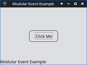
Figure 21.1: Modular Event Handling, Button Click Example
use Prima qw(Application Buttons); # Modular event handler for button clicks sub handle_button_click { my ($button) = @_; $button->text("Clicked!"); print "Button was clicked!\n"; }# Modular event handler for window paint sub handle_window_paint { my ($window, $canvas) = @_; $canvas->clear; $canvas->text_shape_out($window->text, 0, 0); }# Main application my $mw = Prima::MainWindow->new( text => 'Modular Event Example', size => [300, 200], icon => Prima::Icon->load('icon.png'), onPaint => \&handle_window_paint, ); $mw->insert( Button => text => 'Click Me', origin => [100, 80], size => [100, 40], onClick => sub { handle_button_click(@_); }, ); Prima->run;
Listing 21.1: Modular Event Handling, Button Click Example
This next example demonstrates dynamic event handling in Prima by:
- Storing event handlers (e.g.,
on_click ,on_paint ) in a hash (%event_handlers ). - Assigning these handlers to widgets (e.g., a button and window).
- Changing the button's text from "Click Me" to "I Was Clicked!" when clicked, providing visual feedback that the event worked.
Purpose: Show how to centralize, reuse, and dynamically update event logic in Prima applications.

Figure 21.2: Dynamic Event Handler Registration
use Prima qw(Application Buttons);

my %event_handlers = (
    on_click => sub {
        my ($button) = @_;
        $button->text("I Was Clicked!");  # Clearer text change
        $button->color(cl::LightGreen);   # Visual feedback
        print "Button clicked! Text updated.\n";
    },
    on_paint => sub {
        my ($window, $canvas) = @_;
        $canvas->clear;
        $canvas->text_shape_out("Dynamic Paint", 0, 0);
    },
);

my $mw = Prima::MainWindow->new(
    text    => 'Dynamic Event Example',
    size    => [300, 200],
    icon   => Prima::Icon->load('icon.png'),
    onPaint => $event_handlers{on_paint},
);

my $button = $mw->insert(
    Button =>
        text   => 'Click Me',  # Initial text
        origin => [100, 80],
        size   => [100, 40],
        onClick => $event_handlers{on_click},
);

Prima->run;
Listing 21.2: Dynamic Event Handler Registration
Summary key differences between the two examples
| Feature | Modular Event Handlers | Dynamic Event Handler Registration |
|---|---|---|
| Handler Storage | Standalone subroutines | Centralized in a hash |
| Assignment | Static ( |
Dynamic ( |
| Flexibility | Fixed at creation | Can change at runtime |
| Use Case | Clean, maintainable code | Adaptive, runtime-configurable behavior |
| Example Change | Requires code edit | Update hash: |
This is a perfect starting point for interactive UIs where controls react visibly. To make your life easier, here's a list of common Prima widget event handlers (like
These handlers are often defined as widget properties (e.g.
| Widget Type | Common Event Handlers | Notes |
|---|---|---|
| Top-level application window | ||
| Simple clickable button | ||
| Single-line text input | ||
| Multi-line text box | ||
| Passive text label | ||
| Scrollable item list | ||
| Editable dropdown | ||
| Fires periodically when enabled | ||
Table 21.1 Prima Widget Event Handler Cheat Sheet
| Handler | Triggered When… |
|---|---|
| The user clicks (usually a button or clickable widget) | |
| The widget’s content changes (e.g., text updated) | |
| The widget needs to redraw itself | |
| The widget is resized | |
| The widget is moved | |
| A key is pressed | |
| A key is released | |
| A mouse button is pressed inside the widget | |
| A mouse button is released inside the widget | |
| The mouse moves over the widget | |
| The mouse enters the widget’s area | |
| The mouse leaves the widget’s area | |
| A window is closing (you may cancel the close) | |
| The widget receives keyboard focus | |
| A selection changes (e.g., list box, combo box) | |
| The widget draws a single item (e.g., in a list) | |
| A timer event fires |
Table 21.2 Event Handler Descriptions (Quick Reference)
Notes
Widget-specific handlers (e.g.,
All handlers follow the naming convention
or:
21.1.1 Practical example
The program displays a list of countries -like Slovakia, Hungary, and Poland - with their populations, formatted clearly between two static lines. The total population is also shown.
For the static lines we define an
# Draw horizontal lines
$mw->onPaint(sub {
    my ($self) = @_;
    $self->clear;
    $self->color(cl::Black);

    $self->line($C{H_MARGIN}, $UPPER_LINE_Y,  $C{WINDOW_WIDTH} - $C{H_MARGIN},
                                              $UPPER_LINE_Y);
    $self->line($C{H_MARGIN}, $LOWER_LINE_Y,  $C{WINDOW_WIDTH} - $C{H_MARGIN},
                                              $LOWER_LINE_Y);
});
The 16 label items are defined simply using a
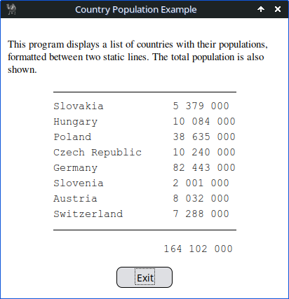
Figure 21.3: Country Population Example with Static Lines
use Prima qw(Application Label Buttons); use List::Util qw(sum); # Data my @countries = ( ['Slovakia', '5 379 000'], ['Hungary', '10 084 000'], ['Poland', '38 635 000'], ['Czech Republic', '10 240 000'], ['Germany', '82 443 000'], ['Slovenia', '2 001 000'], ['Austria', '8 032 000'], ['Switzerland', '7 288 000'], );# Constants my %C = ( WINDOW_HEIGHT => 400, WINDOW_WIDTH => 410, TOP_MARGIN => 25, BOTTOM_MARGIN => 25, LINE_SPACING => 22, DESCRIPTIVE_HEIGHT => 60, H_MARGIN => 75, );# Total population calculation my $total_population = sum map { s/\s+//gr } map { $_->[1] } @countries; my $formatted_total = join ' ', unpack 'A3 A3 A3', $total_population;# Shared label style my %label_style = ( font => { name => 'Courier New', size => 11 }, color => cl::Black, );# Main window my $mw = Prima::MainWindow->new( text => 'Country Population Example', size => [$C{WINDOW_WIDTH}, $C{WINDOW_HEIGHT}], icon => Prima::Icon->load('icon.png'), backColor => cl::White, borderStyle => bs::Dialog, borderIcons => bi::SystemMenu | bi::TitleBar, );# Exit button $mw->insert( Button => origin => [$C{WINDOW_WIDTH} / 2 - 40, $C{BOTTOM_MARGIN} - 10], size => [80, 30], text => 'Exit', onClick => sub { $mw->close }, );# Total population label my $TOTAL_POP_Y = $C{BOTTOM_MARGIN} + 30; $mw->insert( Label => origin => [232, $TOTAL_POP_Y], text => $formatted_total, %label_style, );# Descriptive label my $DESCRIPTION_Y = $C{WINDOW_HEIGHT} - $C{TOP_MARGIN} - $C{DESCRIPTIVE_HEIGHT}; $mw->insert( Label => origin => [10, $DESCRIPTION_Y], width => $C{WINDOW_WIDTH} - 20, text => "This program displays a list of countries with their " . "populations, formatted between two static lines. The " . "total population is also shown.", wordWrap => 1, autoHeight => 1, borderWidth => 1, font => { name => 'Times', size => 11 }, color => cl::Black, );# Calculate positions my $LAST_COUNTRY_Y = $TOTAL_POP_Y + 50; my $FIRST_COUNTRY_Y = $LAST_COUNTRY_Y + $C{LINE_SPACING} * (@countries - 1); my $UPPER_LINE_Y = $FIRST_COUNTRY_Y + 35; my $LOWER_LINE_Y = $LAST_COUNTRY_Y + $C{LINE_SPACING} - 30;# Draw horizontal lines $mw->onPaint(sub { my ($self) = @_; $self->clear; $self->color(cl::Black); $self->line($C{H_MARGIN}, $UPPER_LINE_Y, $C{WINDOW_WIDTH} - $C{H_MARGIN}, $UPPER_LINE_Y); $self->line($C{H_MARGIN}, $LOWER_LINE_Y, $C{WINDOW_WIDTH} - $C{H_MARGIN}, $LOWER_LINE_Y); });# Country labels (bottom -> top) my $y = $LAST_COUNTRY_Y; for my $country (reverse @countries) { my ($name, $pop) = @$country; $mw->insert( Label => origin => [$C{H_MARGIN}, $y], text => $name, %label_style, ); $mw->insert( Label => origin => [245, $y], text => $pop, %label_style, ); $y += $C{LINE_SPACING}; } Prima->run;
Listing 21.3: Country Population Example with Static Lines
21.2 Extension strategy 2: Subclassing and Overriding Methods
Subclassing is a powerful way to extend functionality. In the next example, we’ll define our own widget by inheriting from a built-in Prima class and overriding a method to change how it behaves.
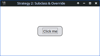
Figure 21.4: subclassing and overriding methods
use Prima qw(Application Buttons); # Define a custom button class MyButton that inherits from Prima::Button package MyButton; use base 'Prima::Button';# Override the profile_default method to customize default widget properties sub profile_default {# Get the object invocant my ($self) = @_;# Call parent class profile_default to get base defaults my $def = $self->SUPER::profile_default;# Set a custom onClick event handler for this button $def->{onClick} = sub {# Event handler arguments: widget and button clicked my ($self, $btn) = @_;# Print a message to the console when the button is clicked print "Button clicked\n"; }; return $def; # Return modified profile hashref }# Define a custom canvas class MyCanvas that inherits from Prima::Widget package MyCanvas; use base 'Prima::Widget';# Override the profile_default method to customize default widget properties sub profile_default { my ($self) = @_; my $def = $self->SUPER::profile_default;# Set a custom onMouseDown event handler for this canvas $def->{onMouseDown} = sub {# Event handler args: widget, mouse button, modifier keys, x, y coords my ($self, $btn, $mod, $x, $y) = @_;# Print coordinates when canvas is clicked print "Canvas clicked at ($x, $y)\n"; }; return $def; }# Return to the main package for script execution package main;# Create the main application window my $mw = Prima::MainWindow->new( text => 'Strategy 2: Subclass & Override', size => [400, 200], icon => Prima::Icon->load('icon.png'), );# Insert a MyCanvas widget into the main window, covering the whole window my $canvas = $mw->insert('MyCanvas', origin => [0, 0], # Position top-left corner size => [$mw->size], backColor => cl::White, );# Insert a MyButton widget into the canvas at a specified location $canvas->insert('MyButton', origin => [150, 80], size => [100, 40], text => 'Click me', ); Prima->run;
Listing 21.4: Subclassing and Overriding Methods
Output e.g.
Canvas clicked at (340, 129)
Button clicked
Canvas clicked at (40, 24)
Button clicked
Should I use this approach?
Pros:
- Ideal for reusable components or large applications.
- Promotes clean, object-oriented design.
Cons:
- Adds boilerplate code.
- May be unnecessary for simple or one-off behaviors.
For simpler cases, inline event handlers may be sufficient (see Section 21.1).
The above example demonstrates the basics of subclassing and overriding the
21.2.1 Custom Button with Enhanced Functionality
Show how to create a custom button that not only logs a message but also changes its appearance (e.g., color, text) when clicked. This will demonstrate how to override multiple methods and properties for more complex behavior.
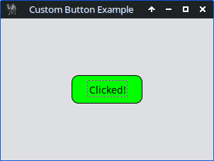
Figure 21.5: Custom Button with Enhanced Functionality
use Prima qw(Application Buttons); # Define a custom button class package MyCustomButton; use base 'Prima::Button';# Override profile_default to set default properties sub profile_default { my ($self) = @_; my $def = $self->SUPER::profile_default; $def->{text} = 'Click Me!'; $def->{backColor} = cl::LightGray; $def->{onClick} = sub { my ($self) = @_; $self->text('Clicked!'); $self->backColor(cl::LightGreen); print "Button was clicked!\n"; }; return $def; }# Main application package main; my $mw = Prima::MainWindow->new( text => 'Custom Button Example', size => [300, 200], icon => Prima::Icon->load('icon.png'), );# Insert the custom button $mw->insert('MyCustomButton', origin => [100, 80], size => [100, 40], ); Prima->run;
Listing 21.5: Custom Button with Enhanced Functionality
21.2.2 Custom Input Field with Validation
Create a custom input field that validates user input (e.g., only allows numeric input). This will show how to override methods like

Figure 21.6: Custom Input Field with Numeric Validation
use Prima qw(Application InputLine); package NumericInput; use base 'Prima::InputLine'; sub profile_default { my ($self) = @_; my $def = $self->SUPER::profile_default; # Set the initial text to empty $def->{text} = ''; $def->{onChange} = sub { my ($self) = @_; my $text = $self->text;# Remove all non-digit characters $text =~ s/[^\d]//g;# Only update if the text changed if ($text ne $self->text) { $self->text($text); } }; return $def; } package main; my $mw = Prima::MainWindow->new( text => 'Numeric Input Example', size => [400, 150], icon => Prima::Icon->load('icon.png'), );# Define the width of the input field my $input_width = 200;# Insert the custom input field and center it my $input = $mw->insert( 'NumericInput', origin => [($mw->width - $input_width) / 2, 60], size => [$input_width, 30], growMode => gm::Center, ); Prima->run;
Listing 21.6: Custom Input Field with Numeric Validation
21.2.3 Custom Canvas with Drawing Functionality
In this larger example we create our own canvas widget by subclassing
on_paint - redraw all stored line segments whenever the canvas repaints.on_mousedown - start drawing and record the initial mouse position.on_mousemove - draw new line segments while the mouse moves.on_mouseup - stop drawing.
The example also shows how to use Prima’s built-in tools to enhance the interface:
- ColorDialog - to pick the line color.
- Slider - to adjust line thickness.
- Button - to clear the canvas.
By combining subclassing with Prima’s built-in widgets, the program is clean, reusable, and interactive, demonstrating the core patterns for GUI development in Prima.
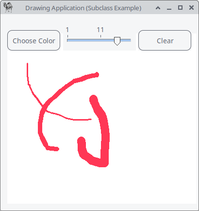
Figure 21.7: Custom Canvas with Drawing Functionality
use Prima qw(Application Buttons Dialog::ColorDialog Sliders); # ============================================================ # MyCanvas – a custom drawing widget # Demonstrates subclassing and overriding Prima widget methods # ============================================================ package MyCanvas; use base qw(Prima::Widget); sub init { my ($self, %profile) = @_; $self->SUPER::init(%profile);# internal state $self->{segments} = []; $self->{drawing} = 0; $self->{last_x} = 0; $self->{last_y} = 0; $self->{current_color} = cl::Black; $self->{current_linewidth} = 2; return $self; }# ------------------------------------------------------------ # Overridden paint event: redraw all stored line segments # ------------------------------------------------------------ sub on_paint { my ($self, $canvas) = @_; $canvas->clear; for my $s (@{ $self->{segments} }) { $canvas->color( $s->{color} ); $canvas->lineWidth( $s->{width} ); $canvas->line( @{ $s->{points} } ); } }# ------------------------------------------------------------ # Overridden mouse-down event: start drawing # ------------------------------------------------------------ sub on_mousedown { my ($self, $btn, $mod, $x, $y) = @_; $self->{drawing} = 1; $self->{last_x} = $x; $self->{last_y} = $y; }# ------------------------------------------------------------ # Overridden mouse-move event: draw while button is held # ------------------------------------------------------------ sub on_mousemove { my ($self, $mod, $x, $y) = @_; return unless $self->{drawing}; push @{ $self->{segments} }, { color => $self->{current_color}, width => $self->{current_linewidth}, points => [ $self->{last_x}, $self->{last_y}, $x, $y ], }; $self->{last_x} = $x; $self->{last_y} = $y; $self->repaint; }# ------------------------------------------------------------ # Overridden mouse-up event: stop drawing # ------------------------------------------------------------ sub on_mouseup { my ($self) = @_; $self->{drawing} = 0; }# ------------------------------------------------------------ # Helper method: clear the drawing # ------------------------------------------------------------ sub clear_canvas { my ($self) = @_; $self->{segments} = []; $self->repaint; }# ------------------------------------------------------------ # Helper method: change current color # ------------------------------------------------------------ sub set_color { my ($self, $color) = @_; $self->{current_color} = $color; }# ------------------------------------------------------------ # Helper method: change current line width # ------------------------------------------------------------ sub set_linewidth { my ($self, $width) = @_; $self->{current_linewidth} = $width; }# ============================================================ # Main Program # ============================================================ package main; my $mw = Prima::MainWindow->new( text => 'Drawing Application (Subclass Example)', size => [400, 400], icon => Prima::Icon->load('icon.png'), );# Create our custom canvas my $canvas = MyCanvas->new( owner => $mw, origin => [10, 10], size => [580, 350], backColor => cl::White, );# ---- COLOR PICKER BUTTON ---- $mw->insert( Button => text => 'Choose Color', origin => [10, 325], onClick => sub { my $dlg = Prima::Dialog::ColorDialog->new; if ($dlg->execute) { $canvas->set_color( $dlg->value ); } }, );# ---- LINE WIDTH SLIDER ---- $mw->insert( Slider => origin => [125, 325], width => 150, min => 1, max => 20, value => 2, onChange => sub { $canvas->set_linewidth( $_[0]->value ); }, );# ---- CLEAR CANVAS BUTTON ---- $mw->insert( Button => text => 'Clear', origin => [280, 325], onClick => sub { $canvas->clear_canvas; }, ); Prima->run;
Listing 21.7: Custom Canvas with Drawing Functionality
Remember:
- Use
profile_default for default properties, - use
init when your widget requires internal state (like arrays, flags, custom attributes).
21.3 Extension strategy 3: Using Composition (Has-a Relationship)
This strategy is about designing own objects that contain Prima objects instead of inheriting from them. Composition means that one object contains another. This is known as a has-a relationship, e.g. a Toolbar has many buttons. This is different from inheritance (is-a relationship), where one class extends another. A simple example:
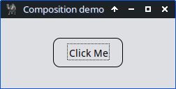
Figure 21.8 Composition in Prima – Simple Controller Example
use Prima qw(Application Buttons); package MyController; # Constructor for the controller class sub new { my ($class, $parent) = @_; # Expect a parent window my $self = bless {}, $class;# Create a button as part of the controller, assign to the parent window $self->{button} = Prima::Button->new( owner => $parent, # Attach to the given window text => 'Click Me', left => 75, bottom => 30, width => 100, onClick => sub { print "Handled by controller\n"; }, ); return $self; } package main; my $mw = Prima::MainWindow->new( text => 'Composition demo', size => [250, 100], icon => Prima::Icon->load('icon.png'), );# Instantiate the controller and pass the window as its parent my $controller = MyController->new($mw); Prima->run;
Listing 21.8: Composition in Prima – Simple Controller Example
Two more examples.
21.3.1 A StatusBar object that contains labels
In this example, we demonstrate composition in Prima by creating a
By organizing the labels inside the
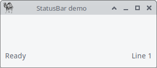
Figure 21.9 Composition, StatusBar Example
use Prima qw(Application Label); package StatusBar; sub new { my ($class, $parent) = @_; my $self = bless {}, $class; # Left label $self->{left_label} = Prima::Label->new( owner => $parent, text => 'Ready', left => 5, bottom => 5, width => 100, );# Right label $self->{right_label} = Prima::Label->new( owner => $parent, text => 'Line 1', left => $parent->width - 105,# 5px margin from right bottom => 5, width => 100, alignment => ta::Right, ); return $self; } package main; my $mw = Prima::MainWindow->new( text => 'StatusBar demo', size => [300, 100], icon => Prima::Icon->load('icon.png'), ); my $status = StatusBar->new($mw); Prima->run;
Listing 21.9: Composition, StatusBar Example
21.3.2 A Toolbar object that contains multiple buttons
This example demonstrates composition (“has-a”) in Perl’s Prima GUI framework. We define a
The key idea is that the
The panel acts as a container at the top of the main window, and the buttons are positioned relative to it. An

Figure 21.10 Composition, Toolbar Example
use Prima qw(Application Buttons); use Prima::Widget::Panel; package Toolbar; sub new { # $class = 'Toolbar', $parent = main window my ($class, $parent) = @_;# Create a new object (hash) and bless it into Toolbar class # $self will *have* panel and buttons — demonstrates composition ("has-a") my $self = bless {}, $class; my $panel_height = 50;# Create the panel at the top of the window $self->{panel} = Prima::Widget::Panel->new( owner => $parent, # Panel is inside the main window left => 0, bottom => $parent->height - $panel_height - 5, width => $parent->width, height => $panel_height, borderWidth => 3, # Optional: give a border for visibility color => cl::LightGray, backColor => cl::LightGray, );# Buttons inside the panel # These are *owned by the panel*, demonstrating composition: # Toolbar has-a Panel, Panel has Buttons $self->{buttons} = [ Prima::Button->new( owner => $self->{panel}, text => 'New', left => 5, bottom => 10, width => 50, height => 30), Prima::Button->new( owner => $self->{panel}, text => 'Open', left => 60, bottom => 10, width => 50, height => 30), Prima::Button->new( owner => $self->{panel}, text => 'Save', left => 115,bottom => 10, width => 50, height => 30), ]; return $self; # Return the fully constructed Toolbar object } package main;# Create the main application window my $mw = Prima::MainWindow->new( text => 'Toolbar Demo', size => [300, 200], icon => Prima::Icon->load('icon.png'), );# Instantiate the Toolbar, passing the main window as its parent my $toolbar = Toolbar->new($mw);# Make the panel span full width and stay at top when window resizes $mw->onSize(sub { $toolbar->{panel}->width($mw->width);# Update panel width $toolbar->{panel}->bottom($mw->height - 50);# Keep panel at top }); Prima->run;
Listing 21.10: Composition, Toolbar Example
21.4 Extension strategy 4: Mixin Modules (Sharing Code Between Classes)
A mixin module is a lightweight, reusable piece of code that provides shared behavior - like logging or formatting - that can be used by multiple classes without relying on inheritance. It’s not a class, but a standalone module containing functions that other classes can call. This approach helps you avoid duplicating code, makes your design more flexible, and keeps things organized by separating common functionality from your main logic.
I made a simple demo illustrating the use of mixins to add reusable behavior to buttons and shared functionality, such as logging or tooltips, without using inheritance.
The demo creates a main window with three buttons demonstrating different combinations of mixins:
- Log Only – prints a message to the console when clicked.
- Tooltip Only – shows a tooltip when hovered.
- Log + Tooltip – combines both behaviors.
Using mixins keeps your code modular and avoids duplicating functionality across multiple classes.
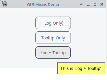
Figure 21.11: Mixin Modules, Reusable Behavior
use Prima qw(Application Buttons Label); # --- Mixins --- # LoggerMixin: provides reusable logging behavior package LoggerMixin; sub log { my ($msg) = @_; print "[LOG] $msg\n"; # Print a message to the console }# TooltipMixin: provides simple tooltip behavior package TooltipMixin; sub set_tooltip { my ($button, $tip) = @_; my $mw = $button->owner; # reference to parent window (not used here)# Set the tooltip for the button when hovered $button->onMouseEnter(sub { $button->hint($tip); # Prima automatically shows this as a tooltip }); }# --- Button Controller Class --- package MyButton; sub new { my ($class, $parent, $text, $left, $bottom, $apply_logging, $apply_tooltip) = @_; my $self = bless {}, $class;# Create the actual Prima button $self->{button} = Prima::Button->new( owner => $parent, text => $text, left => $left, bottom => $bottom, width => 120, );# Apply logging behavior if requested if ($apply_logging) { $self->{button}->onClick(sub { LoggerMixin::log("Button '$text' clicked") }); }# Apply tooltip behavior if requested if ($apply_tooltip) { TooltipMixin::set_tooltip($self->{button}, "This is '$text'"); } return $self; }# --- Main Application --- package main;# Create the main window my $mw = Prima::MainWindow->new( text => 'GUI Mixins Demo', size => [350, 200], );# Instantiate buttons with different combinations of mixins MyButton->new($mw, 'Log Only', 50, 120, 1, 0); # logging only MyButton->new($mw, 'Tooltip Only', 50, 80, 0, 1); # tooltip only MyButton->new($mw, 'Log + Tooltip', 50, 40, 1, 1); # both logging and tooltip Prima->run;
Listing 21.11: Mixin Modules, reusable behavior
21.5 When to Use Which Strategy?
Each extension technique from this chapter serves a different purpose. Here is a quick guide:
- Event Callbacks
Use callbacks when you only need to react to user actions or redraw events, and the behavior is simple. Ideal for small programs or when the logic naturally belongs in the main script. - Subclassing
Choose subclassing when you want to create reusable custom widgets or when a widget needs its own internal state, drawing logic, or default properties. This approach works best for larger or more structured applications. - Composition (Has-a)
Use composition when your object manages other widgets—such as toolbars, status bars, or controllers—without becoming a widget itself. This keeps responsibilities clean and avoids deep inheritance trees. - Mixins
Mixins are helpful when several classes need the same small piece of behavior, such as logging, formatting, or tooltips. They reduce code duplication without forcing inheritance relationships.
Closing words
Extending Prima is ultimately about choosing the approach that keeps your code clear, expressive, and easy to maintain. Whether you attach a simple callback, build a reusable widget through subclassing, organize your interface using composition, or share behavior through mixins, each technique gives you a different level of control over how your application behaves.
The more you work with Prima, the more naturally these strategies will fit together. Most real programs combine them: callbacks for quick reactions, subclasses for custom components, composition for structural clarity, and mixins for shared functionality. Knowing when to apply each one is what turns small scripts into well-designed applications.