 Download PDF
Part 5 - Dynamic and Timed Widgets
15. Time-Based and Status Widgets
In Part 5, we move beyond static user-interface elements and explore widgets that respond to time, events, and user interaction. Many applications rely on components that update themselves - countdowns, clocks, progress indicators -or controls that reflect and modify application state. This part introduces you to Prima's tools for implementing these dynamic behaviors. You’ll learn how to use timers to refresh widgets, display the progress of background operations, and implement interactive toggles that control features, settings, and application modes. By the end of this part, you will be able to design rich, responsive interfaces that feel alive and intuitive.
15.1 Using the Time Widget and Timers
The
We separate the implementation into clear chunks so the logic remains easy to follow.
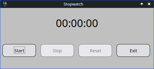
Figure 15.1: Stopwatch with Widget::Time and Timer Class
15.1.1 Main Window Setup
We begin by creating the main window. The size is defined once so all widgets can reference it.
my $app_width  = 500;
my $app_height = 200;

my $mw = Prima::MainWindow->new(
    size        => [$app_width, $app_height],
    text        => 'Stopwatch',
    icon        => Prima::Icon->load('icon.png'),
    backColor   => cl::LightGray,
    borderStyle => bs::Dialog,
    borderIcons => bi::SystemMenu | bi::TitleBar,
);
15.1.2 The Time Display (Widget::Time)
The
my $size_widget = 180;

$mw->insert( 'Widget::Time' =>
    origin    => [($app_width/2) - ($size_widget/2), 130],
    size      => [$size_widget, 39],
    name      => 'Time',
    time      => [0,0,0], # [sec, min, hour]
    format    => 'hh:mm:ss',
    alignment => ta::Center,
    font      => { size => 26 },
    readOnly  => 1,
    enabled   => 0,
    disabledBackColor => cl::LightGray,
    disabledColor     => cl::Black,
);
This widget never receives keyboard input; the stopwatch updates it automatically.
15.1.3 Stopwatch State Machine
We keep the entire stopwatch state in one hash
my %S = ( start_time => undef, # when counting started paused_from => undef,# when pause started paused_total => 0.0,# accumulated pause time running => 0, );
The reset helper restores everything:
sub reset_stopwatch {
    %S = (
        start_time => undef,
        paused_from => undef,
        paused_total => 0.0,
        running => 0 );

    $mw->Time->time([0,0,0]);
    $mw->mcTimer->stop;

    $mw->start_button->enabled(1);
    $mw->start_button->focused(1);
    $mw->stop_button->enabled(0);
    $mw->reset_button->enabled(0);
}
15.1.4 Calculating and Updating the Display
Every tick, the elapsed time is computed based on whether the stopwatch is running or paused.
sub update_display {
    return unless $S{start_time};

    my $now = time();
    my $elapsed =
        $S{running} ? $now - $S{start_time} - $S{paused_total}
                    : ($S{paused_from}
                          ? $S{paused_from} - $S{start_time} - $S{paused_total}
                          : 0);

    $elapsed = 0 if $elapsed < 0;

    my $hour = int($elapsed / 3600);
    my $min  = int(($elapsed % 3600) / 60);
    my $sec  = int($elapsed % 60);

    $mw->Time->time([$sec, $min, $hour]);
}
15.1.5 The Timer Object
A Prima
$mw->insert(Timer =>
    name    => 'mcTimer',
    timeout => 1000,
    onTick  => sub { update_display() },
);
15.1.6 Start, Stop, Reset Buttons
These handlers form the user interface:
my %actions = (
    exit_button => sub { $::application->close },

    start_button => sub {
        unless ($S{start_time}) {
            $S{start_time}   = time();
            $S{paused_total} = 0.0;
        }
        if (defined $S{paused_from}) {
            $S{paused_total} += time() - $S{paused_from};
            $S{paused_from} = undef;
        }

        $S{running} = 1;
        update_display();
        $mw->mcTimer->start;

        $mw->start_button->enabled(0);
        $mw->stop_button->enabled(1);
        $mw->stop_button->focused(1);
        $mw->reset_button->enabled(0);
    },

    stop_button => sub {
        return unless $S{running};

        $S{paused_from} = time();
        $S{running} = 0;
        $mw->mcTimer->stop;

        $mw->start_button->enabled(1);
        $mw->start_button->focused(1);
        $mw->reset_button->enabled(1);
    },

    reset_button => sub { reset_stopwatch() },
);
The buttons themselves are inserted into a container widget.
15.1.7 Full Program Stopwatch
use Prima qw(Buttons Application Widget::Time); # Time::HiRes::time gives us sub-second precision timestamps as a # single floating value use Time::HiRes qw(time);# size of application; defined once so we can reuse it consistently my $app_width = 500; my $app_height = 200; my $mw = Prima::MainWindow->new( size => [$app_width, $app_height], text => 'Stopwatch', icon => Prima::Icon->load('icon.png'), backColor => cl::LightGray, borderStyle => bs::Dialog, borderIcons => bi::SystemMenu | bi::TitleBar, );# size of the time display widget; my $size_widget = 180;# insert a Widget::Time control into the main window. Widget::Time displays # an hour:minute:second value. IMPORTANT: it expects the time array as # [sec, min, hour] (this order is how Prima defines the property). $mw->insert('Widget::Time' => origin => [($app_width / 2) - ($size_widget / 2), 130], size => [$size_widget, 39], name => 'Time', time => [0, 0, 0], # initial value [sec, min, hour] format => 'hh:mm:ss', # formatting pattern for display borderWidth => 0, alignment => ta::Center, font => { size => 26 }, cursorVisible => 0, readOnly => 1, enabled => 0, # disabled so user can't edit it# disabledBackColor COLOR # The color to be used instead of the value of the ::backColor property # when the widget is in the disabled state. disabledBackColor => cl::LightGray,# disabledColor COLOR # The color to be used instead of the value of the ::color property # when the widget is in the disabled state disabledColor => cl::Black, );# --- Stopwatch state --- # we keep all state in a single lexical hash %S so it's easy to reason about. # keys: # - start_time: epoch seconds (floating) when the stopwatch first started # - paused_from: epoch seconds when a pause (stop) began # - paused_total: total seconds spent paused (accumulated) # - running: boolean flag (1 when stopwatch is running) my %S = ( start_time => undef, paused_from => undef, paused_total => 0.0, running => 0, );# reset_stopwatch: helper to reset the state and UI back to initial values. # a 'reset' should both change the timer value shown and stop any # running timer loop (so the program doesn't keep updating the display). sub reset_stopwatch { %S = ( start_time => undef, paused_from => undef, paused_total => 0.0, running => 0 );# Widget::Time expects [sec, min, hour] $mw->Time->time([0,0,0]);# stop the periodic Timer so it stops calling update_display $mw->mcTimer->stop;# enable/disable buttons to reflect the reset state $mw->start_button->enabled(1);# move keyboard focus to Start so a user can press Enter to begin $mw->start_button->focused(1); $mw->stop_button->enabled(0); $mw->reset_button->enabled(0); }# update_display: compute the elapsed time and write it to the Widget::Time display. # Explanation of the math: # - if running: elapsed = now - start_time - paused_total # - if paused: elapsed = paused_from - start_time - paused_total # the paused_total variable already contains previous pause durations. When we # resume, we add the current pause length to paused_total so the display never # counts paused time. sub update_display {# if never started, there is nothing to display return unless $S{start_time}; my $now = time();# choose how to compute elapsed depending on running/paused state my $elapsed = $S{running} ? $now - $S{start_time} - $S{paused_total} : ($S{paused_from} ? $S{paused_from} - $S{start_time} - $S{paused_total} : 0);# guard against tiny negative values due to timing precision $elapsed = 0 if $elapsed < 0;# break down into hours / minutes / seconds my $hour = int($elapsed / 3600); my $min = int(($elapsed % 3600) / 60); my $sec = int($elapsed % 60);# Widget::Time wants [sec, min, hour] $mw->Time->time([$sec, $min, $hour]); }# Timer: runs every 1000 ms (1 second) and updates the display for an # hh:mm:ss display, one-second resolution is enough and saves CPU. $mw->insert(Timer => name => 'mcTimer', timeout => 1000, # milliseconds onTick => sub { update_display() }, );# Buttons: definitions and layout # we create a small button container widget and then insert four buttons # into it my @buttons = ( { name => 'start_button', text => 'Start', enabled => 1 }, { name => 'stop_button', text => 'Stop', enabled => 0 }, { name => 'reset_button', text => 'Reset', enabled => 0 }, { name => 'exit_button', text => 'Exit', enabled => 1 }, );# a plain Widget acts as a simple container to pack buttons horizontally. my $button_widget = $mw->insert(Widget => origin => [0, 10], size => [$app_width, 100], backColor => cl::LightGray, );# Button action handlers # each coderef manipulates the %S state and the UI to provide the expected # behavior my %actions = ( exit_button => sub { $::application->close },# Start: either start fresh or resume from a paused state start_button => sub {# if we've never started (or have reset), record the start time unless ($S{start_time}) { $S{start_time} = time();# ensure previously paused time doesn't leak through $S{paused_total} = 0.0; }# if resuming after a pause, compute how long we were paused and # add to paused_total if (defined $S{paused_from}) { $S{paused_total} += time() - $S{paused_from}; $S{paused_from} = undef; # clear the paused marker } $S{running} = 1; # mark as running update_display(); # refresh immediately so user sees instant response $mw->mcTimer->start; # start the periodic updates# update button states: Start disabled while running; Stop enabled $mw->start_button->enabled(0); $mw->stop_button->enabled(1);# move keyboard focus to Stop so pressing Enter will stop the stopwatch $mw->stop_button->focused(1); $mw->reset_button->enabled(0); },# Stop: pause the stopwatch without losing elapsed time stop_button => sub {# if already paused or never started, do nothing return unless $S{running};# mark the time the pause began $S{paused_from} = time(); $S{running} = 0; $mw->mcTimer->stop; # stop periodic updates to save CPU# update buttons: start available to resume; reset becomes available $mw->start_button->enabled(1);# move keyboard focus back to Start so Enter resumes $mw->start_button->focused(1); $mw->reset_button->enabled(1); }, reset_button => sub { reset_stopwatch(); }, );# insert button widgets into the container using simple packing rules foreach my $btn (@buttons) { $button_widget->insert(Button => pack => { fill => 'x', side => 'left', pad => 15 }, name => $btn->{name}, text => $btn->{text}, enabled => $btn->{enabled}, onClick => $actions{$btn->{name}}, ); } Prima->run;
Listing 15.1: Stopwatch with Widget::Time and Timer Class
15.2 Progress Bars for Background Tasks
This example builds a countdown timer with:
- A dropdown to choose duration
- A progress bar that changes color (green → orange → red)
- A digital time display
- A Start/Stop toggle button
- A popup dialog at completion
The code is long, so here it is in digestible chunks.
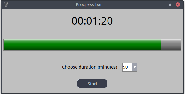

Figure 15.2: Timer Class and Progressbar
15.2.1 Window and Time Display
my $app_width = 600;

my $mw = Prima::MainWindow->new(
    text      => 'Progress bar',
    size      => [$app_width, 280],
    backColor => cl::LightGray,
    icon      => Prima::Icon->load('icon.png'),
    borderStyle => bs::Dialog,
    borderIcons => bi::SystemMenu|bi::TitleBar,
);

my $size_widget = 180;

$mw->insert('Widget::Time' =>
    origin  => [(($app_width/2)-($size_widget/2)), 220],
    size    => [$size_widget, 39],
    name    => 'Time',
    time    => [0,0,0],
    format  => 'hh:mm:ss',
    alignment => ta::Center,
    font    => { size => 26 },
    enabled => 0,
    disabledBackColor => cl::LightGray,
    disabledColor      => cl::Black,
);
15.2.2 Timer Variables and Progress Bar
my $remaining_time = 60;
my $copy_remaining_time;
my $start = 0;

my $progressbar = $mw->insert( 'Prima::ProgressBar',
    origin => [5, 140],
    width  => $app_width-10,
    height => 40,
    max    => $remaining_time,
    min    => 0,
    value  => $remaining_time,
    color  => cl::Green,
);
15.2.3 Reset Function
sub reset_timer {
    my $stop = shift;
    $mw->mcTimer->stop if $stop;

    $btn->text('Start');
    $start = 0;

    $remaining_time = 60;
    $copy_remaining_time = $remaining_time;

    $duration_combo->text(60);

    $progressbar->color(cl::Green);
    $progressbar->max($remaining_time);
    $progressbar->value($remaining_time);

    $mw->Time->time([0,0,0]);
    $duration_combo->enabled(1);
}
15.2.4 Timer Tick Logic (start_timer)
This is the heart of the countdown.
sub start_timer {
    if ($start == 0) {
        $progressbar->max($remaining_time);
        $copy_remaining_time = $remaining_time;
        $start = 1;
    }

    $duration_combo->enabled(0);

    $progressbar->color(0xffa500)
        if $remaining_time < 0.5 * $copy_remaining_time;

    $progressbar->color(cl::Red)
        if $remaining_time < 11;

    if ($remaining_time >= 0) {
        my ($h, $m, $s) = (
            int($remaining_time / 3600),
            int(($remaining_time % 3600) / 60),
            int($remaining_time % 60),
        );

        $mw->Time->time([$h,$m,$s]);
        $progressbar->value($remaining_time);
        $remaining_time--;
    }
    else {
        $mw->mcTimer->stop;
        showMessageDialog(300, 150, "Info",
            "Countdown complete!\n\nThe program will now reset all.");
        reset_timer(0);
    }
}
15.2.5 Timer Object
$mw->insert(Timer =>
    name    => 'mcTimer',
    timeout => 1000,
    onTick  => sub { start_timer() },
);
15.2.6 Duration Selector (ComboBox)
$duration_combo = $mw->insert(ComboBox =>
    origin => [(($app_width/2) + 100), 70],
    size   => [50, 30],
    items  => [60 .. 300],
    style  => cs::DropDown,
    readOnly => 1,
    onChange => sub { $remaining_time = $_[0]->text },
);
15.2.7 Start/Stop Button
$btn = $mw->insert(Button =>
    origin => [(($app_width/2)-(100/2)), 15],
    size   => [100, 30],
    text   => 'Start',
    onClick => sub {
        $btn = $_[0];
        if ($btn->text eq 'Start') {
            $btn->text('Stop');
            $mw->mcTimer->start;
        }
        else {
            reset_timer(1);
        }
    },
);
15.2.8 Full Program Countdown Timer
use Prima qw(Application Buttons Label ComboBox Sliders Widget::Time ); use lib '.'; require "showMessageDialog.pl"; my $app_width = 600; my $mw = Prima::MainWindow->new( text => 'Progress bar', size => [ $app_width, 280 ], backColor => cl::LightGray, icon => Prima::Icon->load('icon.png'), borderStyle => bs::Dialog, borderIcons => bi::SystemMenu|bi::TitleBar, ); # Define size for the time display widget my $size_widget = 180;# Insert a digital clock/time display widget into the main window $mw->insert( 'Widget::Time' => origin => [(($app_width/2) - ($size_widget/2)), 220], size => [$size_widget, 39], name => 'Time',# Initial time 00:00:00 time => [0,0,0],# Time format format => 'hh:mm:ss', borderWidth => 0, alignment => ta::Center, font => { size => 26, }, enabled => 0,# see previous code 15.1 disabledBackColor => cl::LightGray, disabledColor => cl::Black, ); my $remaining_time = 60; my $copy_remaining_time; my $btn; my $duration_combo; my $start = 0; my $progressbar = $mw->insert('Prima::ProgressBar', origin => [ 5, 140 ], width => $app_width-10, height => 40, max => $remaining_time, min => 0, value => $remaining_time, color => cl::Green, );# Reset function sub reset_timer { my $stop = @_; $mw->mcTimer->stop if ($stop); $btn->text('Start'); $start = 0; $remaining_time = 60; $copy_remaining_time = $remaining_time; $duration_combo->text(60); $progressbar->color(cl::Green); $progressbar->max($remaining_time); $progressbar->min(0); $progressbar->value($remaining_time); $mw->Time->time([0,0,0]); $duration_combo->enabled(1); }# Timer tick function sub start_timer { if ($start == 0) { $progressbar->max($remaining_time); $copy_remaining_time = $remaining_time; $start = 1; } $duration_combo->enabled(0);# the first color change after 50% elapsed time $progressbar->color(0xffa500) if ($remaining_time < ( 0.5 * $copy_remaining_time) );# always the last 10 seconds color red $progressbar->color(cl::Red) if ($remaining_time < 11 ); if ($remaining_time >= 0) { my ($seconds, $minutes, $hours) = ( (int($remaining_time / 3600)), (int(($remaining_time % 3600) / 60)), (int($remaining_time % 60)) ); $mw->Time->time([$hours,$minutes,$seconds]); $progressbar->value($remaining_time); $remaining_time--; } else { $mw->mcTimer->stop; showMessageDialog( 300, 150, "Info", "Countdown complete!\n\nThe program will now reset all."); reset_timer(0); } } $mw->insert( Timer => name => 'mcTimer', timeout => 1000, onTick => sub { start_timer, }, ); $mw->insert( Label => origin => [(($app_width/2) - (200/2)), 70], size => [200, 25], text => "Choose duration (seconds)", font => { size => 11, }, color => cl::Black, );# Duration selection ComboBox $duration_combo = $mw->insert( ComboBox => origin => [(($app_width/2) + 100), 70], size => [50, 30], name => $remaining_time, items => [ 60 .. 300 ], style => (cs::DropDown), editProfile => { backColor => cl::White, color => cl::Black }, listProfile => { backColor => cl::White, color => cl::Black }, readOnly => 1,# Update $remaining_time when changed onChange => sub{ $remaining_time = $_[0]->text; }, );# Start/Stop button $btn = $mw->insert( Button => origin => [(($app_width/2) - (100/2)), 15], name => 'start_button', size => [100, 30], text => "Start", onClick => sub { $btn = $_[0]; if ($btn->text eq 'Start') {# start or resume $btn->text('Stop');# if it was a fresh start, start_timer() will do # initialization $mw->mcTimer->start; } else { reset_timer(1); } }, ); Prima->run;
Listing 15.2: Timer Class and Progressbar
Later I'll show you how I built a custom timer in Prima, using the visual builder.
15.3 Toggle Buttons and Interactive State Controls
Many applications need controls that change appearance or behavior depending on the current mode. In Prima, you can combine radio buttons, checkboxes, and toggle-style buttons to build dynamic interfaces that react to user input.
In this section, we build a small demo where:
- Selecting Mode A, B, or C updates a color panel.
- Mode B enables a checkbox.
- Mode C enables a custom toggle button.
- The interface updates immediately depending on the user's choice.
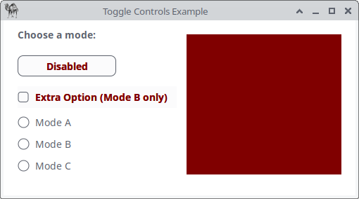
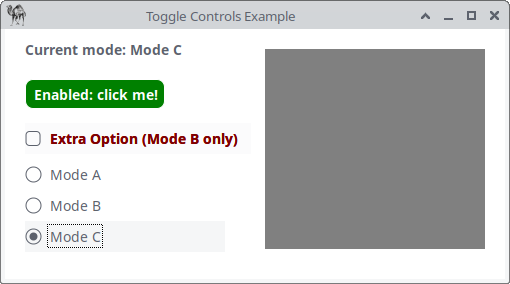
Figure 15.3: Toggle Controls
15.3.1 The Main Window and Panel
We begin by creating the window and a panel that will reflect the current mode (through background color).
my $mw = Prima::MainWindow->new(
    text      => 'Toggle Controls Example',
    size      => [500, 250],
    backColor => cl::White,
    icon      => Prima::Icon->load('icon.png'),
);

# Panel reflecting the current mode
my $panel = $mw->insert(Widget =>
    origin    => [260, 30],
    size      => [220, 200],
    backColor => cl::Red,
);
The panel is our visual feedback element. Every mode will change its color.
15.3.2 Status Label
We display the current mode at the top left.
The
my $label = $mw->insert(Label =>
    text   => M 'B<Choose a mode:>',
    origin => [20, 215],
);
15.3.3 Toggle Button (Enabled Only in Mode C)
This button changes the panel color between Cyan and Green, but it is initially disabled.
my $toggle_state = 0;

my $btn_toggle = $mw->insert(Button =>
    text      => M 'B<C<Red|Disabled>>',
    origin    => [20, 170],
    size      => [140, 30],
    enabled   => 0,
    backColor => cl::White,
    color     => cl::Black,
    onClick   => sub {
        $toggle_state = !$toggle_state;
        $panel->backColor($toggle_state ? cl::Green : cl::Cyan);
        $label->text(M "B<Custom Toggle: " . ($toggle_state ? 'ON' : 'OFF') . ">");
    },
);
Key point: This toggle is only accessible when Mode C is selected.
15.3.4 Checkbox (Enabled Only in Mode B)
Mode B activates a checkbox that modifies the panel color.
my $chk_extra = $mw->insert(CheckBox =>
    text    => M 'B<C<Red|Extra Option (Mode B only)>>',
    origin  => [20, 125],
    enabled => 0,
    onClick => sub {
        $panel->backColor($_[0]->checked ? cl::Black : cl::Gray);
    },
);
When checked, the panel turns black, otherwise gray.
15.3.5 Radio Modes and Dynamic State Switching
The three radio buttons drive the entire interface.
Their
my $grp = $mw->insert(GroupBox => text => 'Modes', origin => [20, 20], size => [200, 100], border => 0, onRadioClick => sub { my $mode = $_[1]->text; $label->text(M "B<Current mode: $mode>"); # Reset UI elements $btn_toggle->enabled(0); $btn_toggle->text(M 'B<C<Red|Disabled>>'); $btn_toggle->backColor(cl::White); $btn_toggle->color(cl::Black); $chk_extra->enabled(0); $chk_extra->text(M 'B<C<Red|Extra Option (Mode B only)>>'); $toggle_state = 0;# Mode-specific behavior if ($mode eq 'Mode A') { $panel->backColor(cl::LightBlue); } elsif ($mode eq 'Mode B') { $panel->backColor(cl::Yellow); $chk_extra->enabled(1); $chk_extra->text(M 'B<C<Green|Extra Option (Mode B only)>>'); } elsif ($mode eq 'Mode C') { $panel->backColor(cl::Gray); $btn_toggle->enabled(1); $btn_toggle->backColor(cl::Green); $btn_toggle->color(cl::White); $btn_toggle->text(M 'B<C<White|Enabled: click me!>>'); } }, );
Then we insert the radio buttons:
$grp->insert(Radio =>
    text => 'Mode A', pack => { side => 'top', fill => 'x' });
$grp->insert(Radio =>
    text => 'Mode B', pack => { side => 'top', fill => 'x' });
$grp->insert(Radio =>
    text => 'Mode C', pack => { side => 'top', fill => 'x' });
Finally:
Prima->run;
15.3.6 Full Program Toggle Controls
use Prima qw(Application Buttons Label); use Prima::Drawable::Markup q(M); my $mw = Prima::MainWindow->new( text => 'Toggle Controls Example', size => [500, 250], backColor => cl::White, icon => Prima::Icon->load('icon.png'), ); # ---------------------------------------- # Panel that reflects current mode/state # ---------------------------------------- my $panel = $mw->insert(Widget => origin => [260, 30], size => [220, 200], backColor => cl::Red );# ---------------------------------------- # Status label # ---------------------------------------- my $label = $mw->insert(Label => text => M 'B<Choose a mode:>', origin => [20, 215], );# ---------------------------------------- # Toggle Button (Mode C only) # ---------------------------------------- my $toggle_state = 0; my $btn_toggle = $mw->insert(Button => text => M 'B<C<Red|Disabled>>', origin => [20, 170], size => [140, 30], enabled => 0, backColor => cl::White, color => cl::Black, onClick => sub { $toggle_state = !$toggle_state; $panel->backColor($toggle_state ? cl::Green : cl::Cyan); $label->text(M "B<Custom Toggle: " . ($toggle_state ? 'ON' : 'OFF') . ">"); }, );# ---------------------------------------- # Checkbox (Mode B only) # ---------------------------------------- my $chk_extra = $mw->insert(CheckBox => text => M 'B<C<Red|Extra Option (Mode B only)>>', origin => [20, 125], enabled => 0, onClick => sub { $panel->backColor($_[0]->checked ? cl::Black : cl::Gray); }, );# ---------------------------------------- # Radio Modes # ---------------------------------------- my $grp = $mw->insert(GroupBox => text => 'Modes', origin => [20, 20], size => [200, 100], border => 0, onRadioClick => sub { my $mode = $_[1]->text; $label->text(M "B<Current mode: $mode>");# Reset controls $btn_toggle->enabled(0); $btn_toggle->text(M 'B<C<Red|Disabled>>'); $btn_toggle->backColor(cl::White); $btn_toggle->color(cl::Black); $chk_extra->enabled(0); $chk_extra->text(M 'B<C<Red|Extra Option (Mode B only)>>'); $toggle_state = 0; if ($mode eq 'Mode A') { $panel->backColor(cl::LightBlue); } elsif ($mode eq 'Mode B') { $panel->backColor(cl::Yellow); $chk_extra->enabled(1); $chk_extra->text(M 'B<C<Green|Extra Option (Mode B only)>>'); } elsif ($mode eq 'Mode C') { $panel->backColor(cl::Gray); $btn_toggle->enabled(1); $btn_toggle->backColor(cl::Green); $btn_toggle->color(cl::White); $btn_toggle->text(M 'B<C<White|Enabled: click me!>>'); } }, ); $grp->insert(Radio => text => 'Mode A', pack => { side => 'top', fill => 'x' }); $grp->insert(Radio => text => 'Mode B', pack => { side => 'top', fill => 'x' }); $grp->insert(Radio => text => 'Mode C', pack => { side => 'top', fill => 'x' }); Prima->run;
Listing 15.3: Toggle Controls
Closing Words
In this part, you learned how to bring your Prima applications to life with dynamic, time-based, and interactive widgets. We explored timers, status displays, progress indicators, and user-controlled interface states. By breaking each program into clear conceptual chunks, the underlying mechanics become easier to understand, while the complete listings provide runnable reference implementations.
Each section includes small code chunks for clarity, followed by a complete annotated program in its own full listing. These listings allow you to study or extend each example in context.
Listing 15.1 Stopwatch
A time-tracking application demonstrating
Listing 15.2 Countdown Timer
A countdown tool with a progress bar, dynamic color feedback, a duration selector, and a Start/Stop toggle button.
Listing 15.3 Toggle Controls Example
An interface showcasing radio buttons, checkboxes, and a custom toggle button, illustrating how to manage interactive application state.